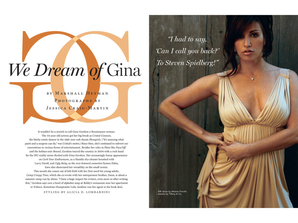
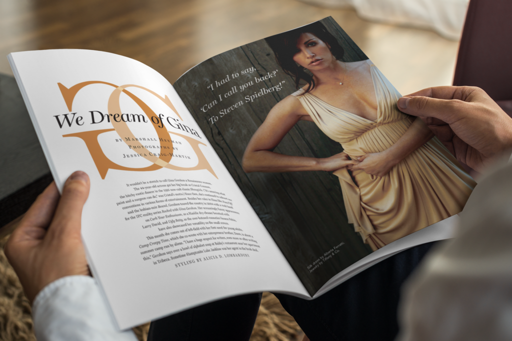
This editorial layout was designed for a feature on actress Gina Gershon in Hampton Style magazine. Inspired by Gucci’s classic logo and palette, the spread integrates bold typographic elements with clean, balanced composition to highlight Gershon’s elegance and presence. The design complements the natural tones of her dress while maintaining a refined, fashion-forward aesthetic that reflects the sophistication of both the subject and the publication.
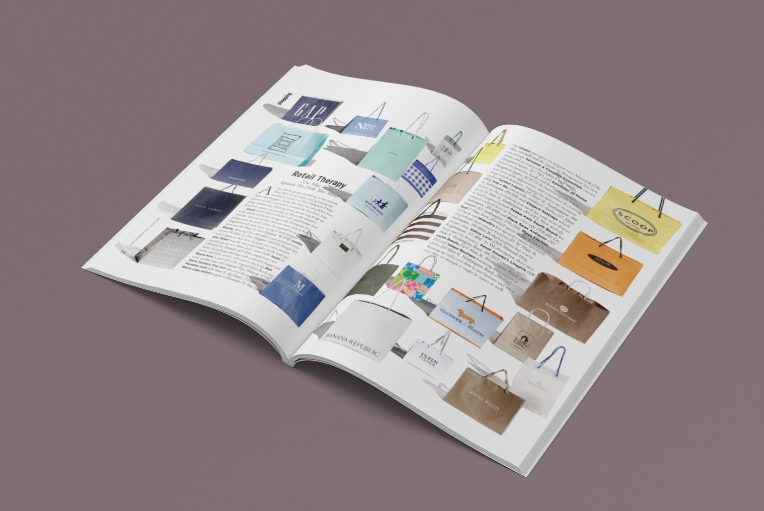
shopping guide article
For this editorial shopping guide, I created a fresh and clever visual approach by showcasing each store through photographs of their shopping bags rather than traditional storefront images or simple logos. This choice brought texture, personality, and a tactile sense of the shopping experience to the layout. Paired with clean typography and structured composition, the design captures the excitement of discovery while giving the guide a stylish, contemporary edge.
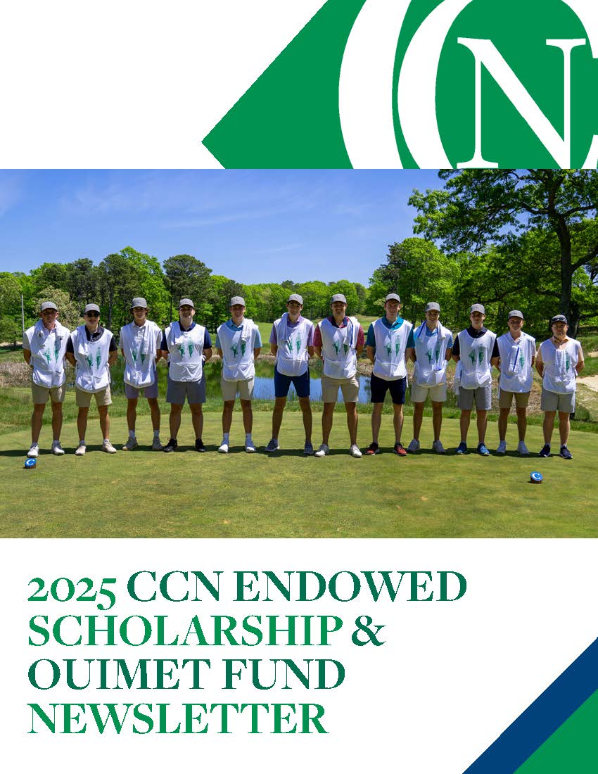
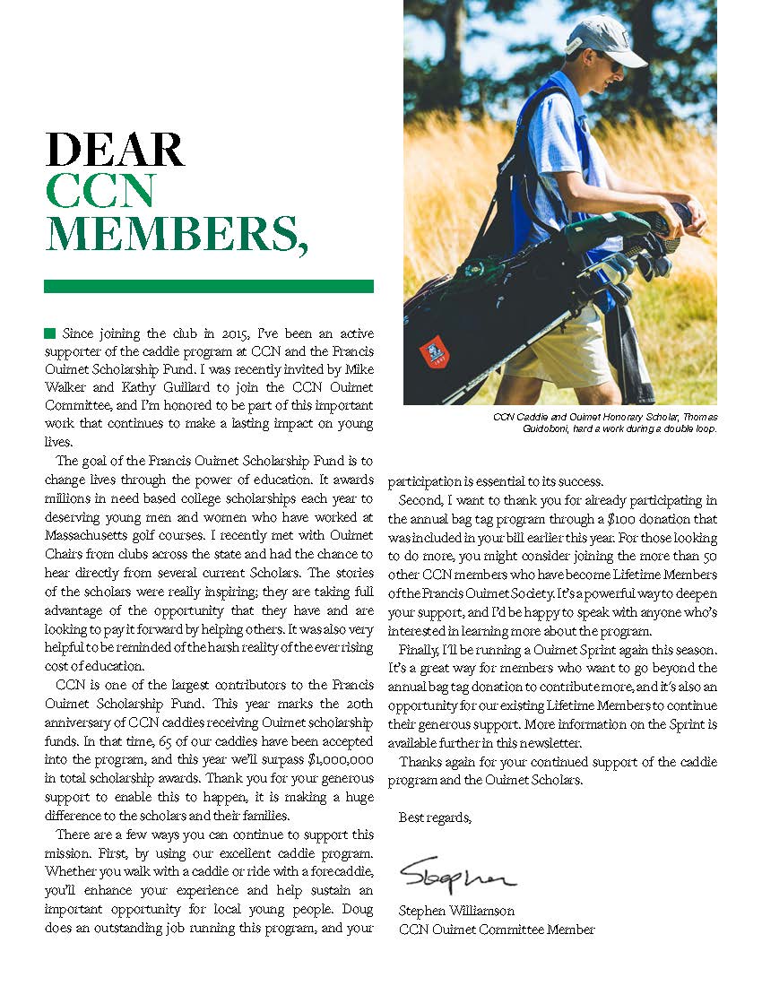
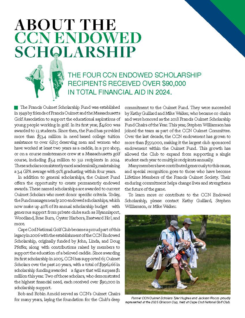
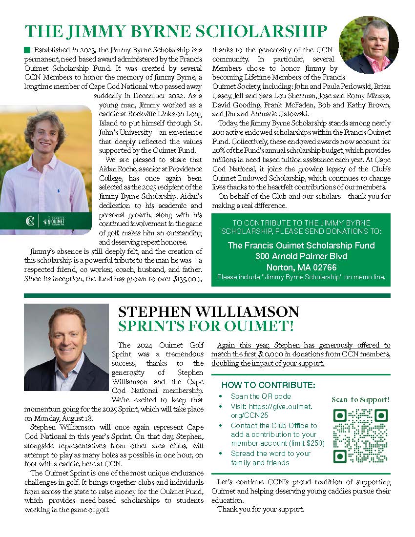
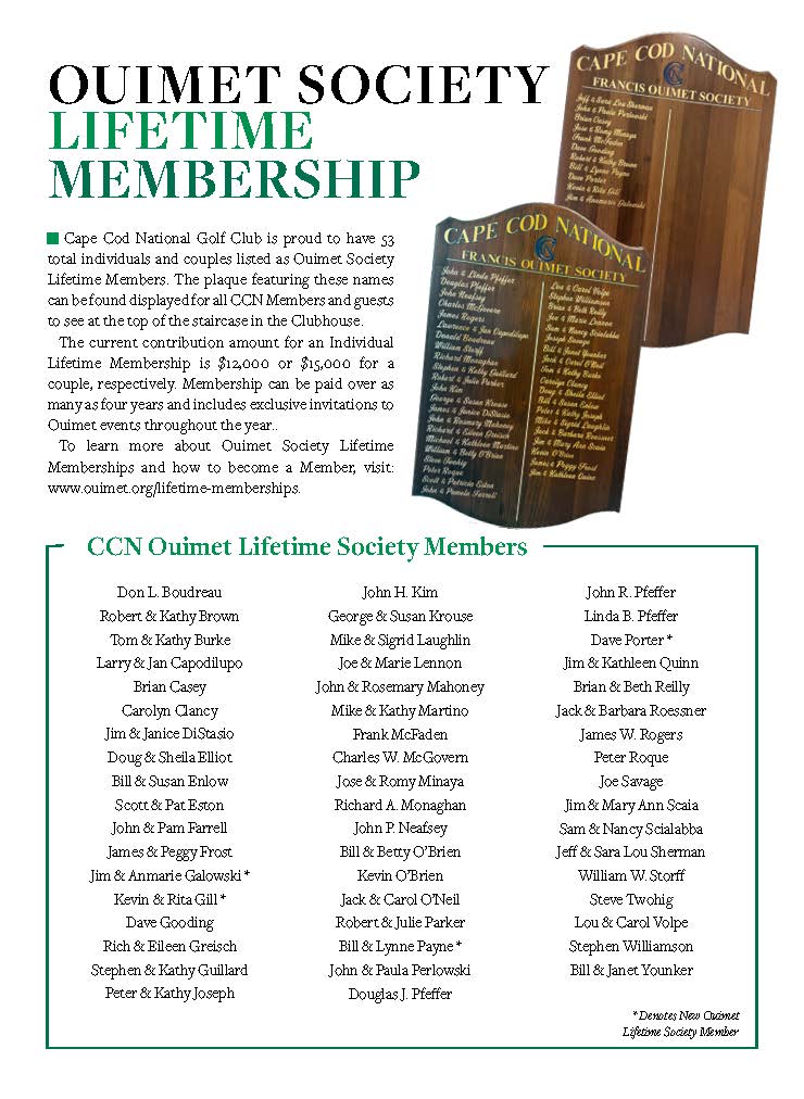
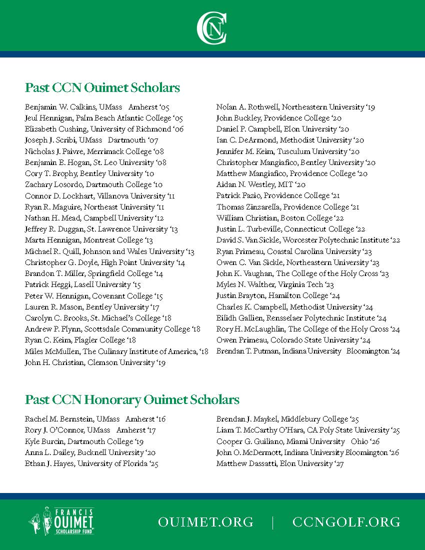
Francis Ouimet Scholarship Fund Newsletter
I designed a newsletter for the Francis Ouimet Scholarship Fund that highlights the organization’s mission, impact, and community stories with clarity and elegance. The layout balances engaging photography, thoughtful typography, and well-structured content to showcase the scholars, events, and donors who bring the fund to life. The design reflects the Fund’s tradition and prestige while keeping the publication accessible and inviting, ensuring readers are inspired to stay connected and support its ongoing work.
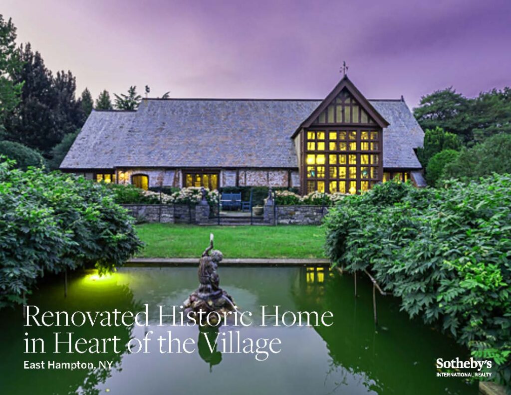
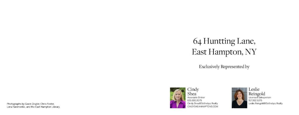
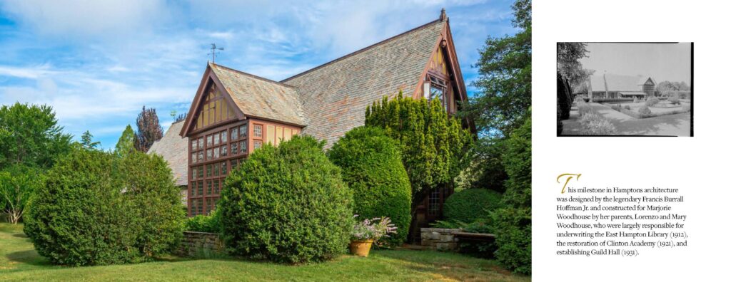
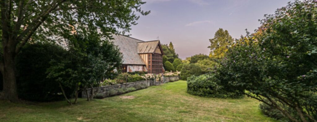
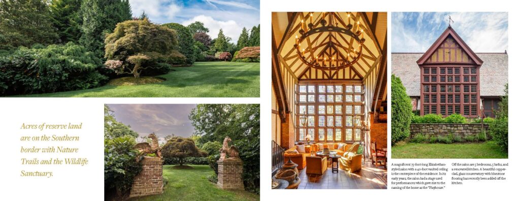
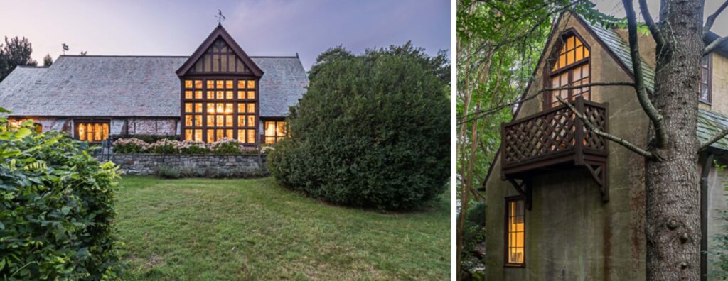
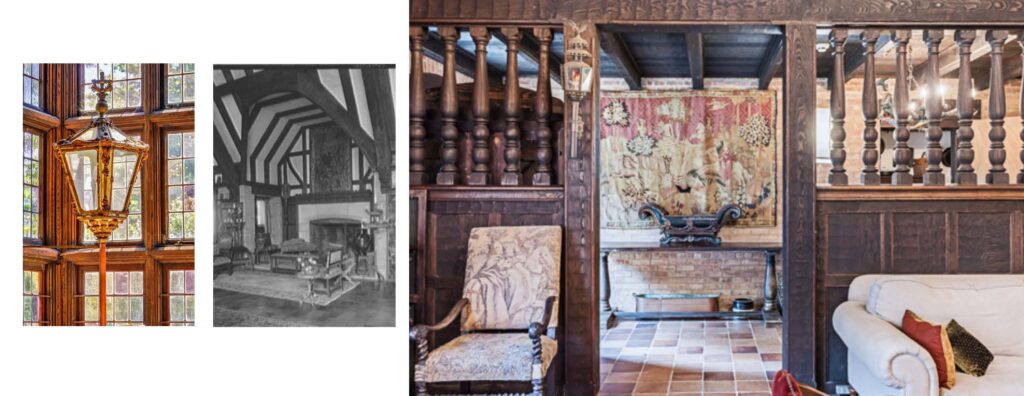
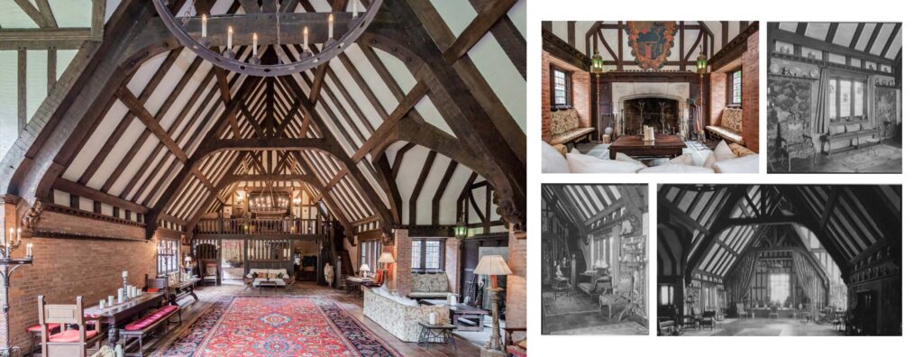
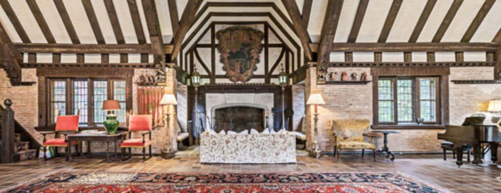
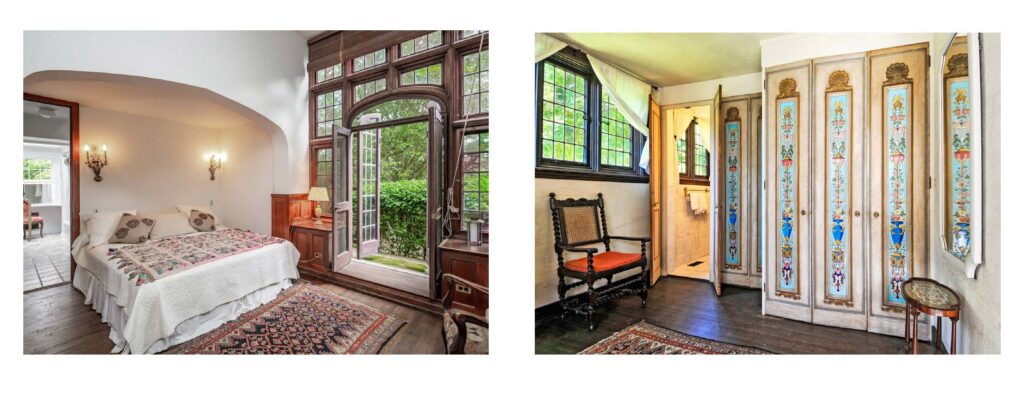
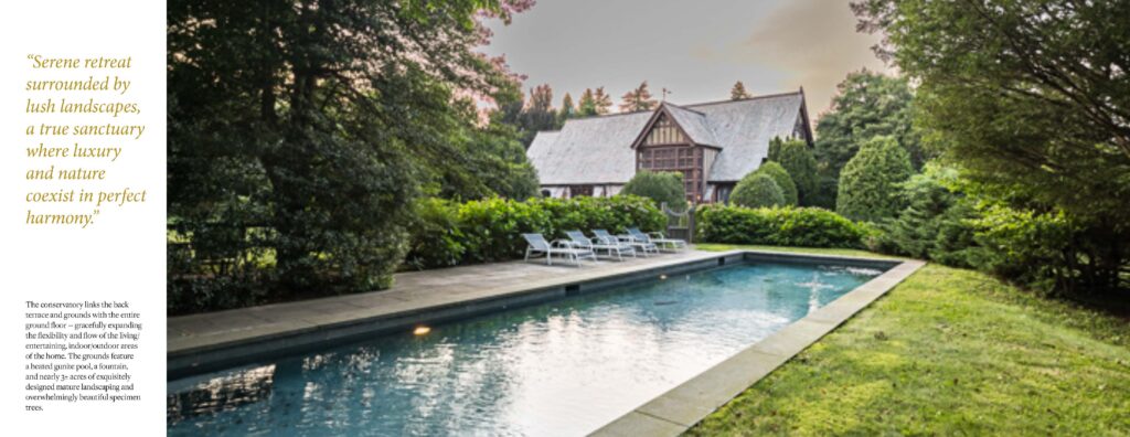
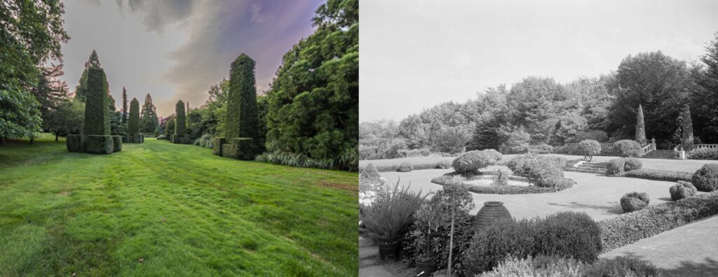
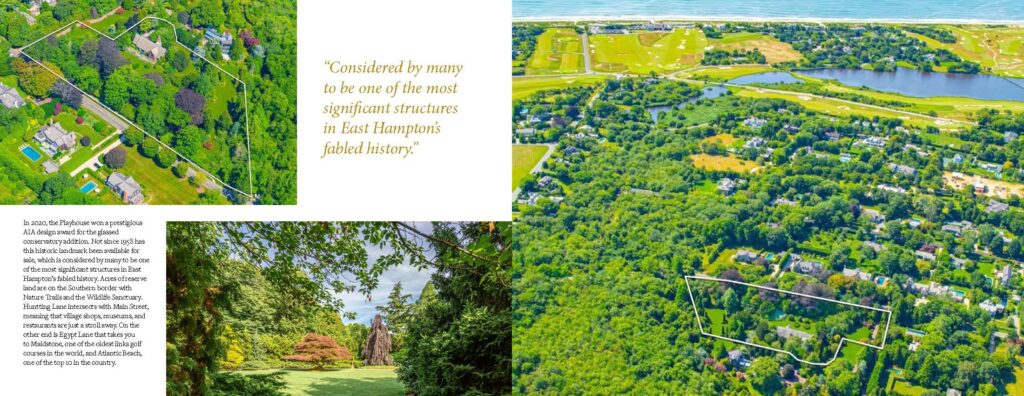
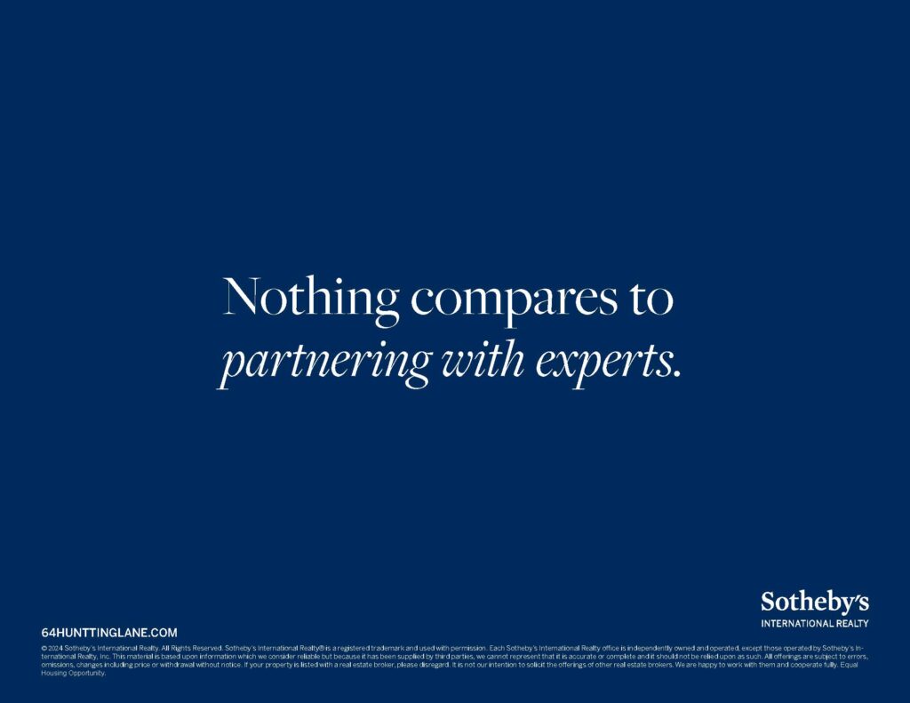
property limited edition book 64 huntting, east hampton
I crafted a limited-edition property book for the sale of the historic East Hampton estate at 64 Hunting Lane. Designed in a magazine-style format, the brochure combined elegant typography, full-bleed photography, and refined layouts to tell the story of the home’s architectural significance and timeless character. The design elevated the property beyond a standard brochure, creating a collectible piece that reflected both the prestige of the listing and the Sotheby’s International Realty brand.
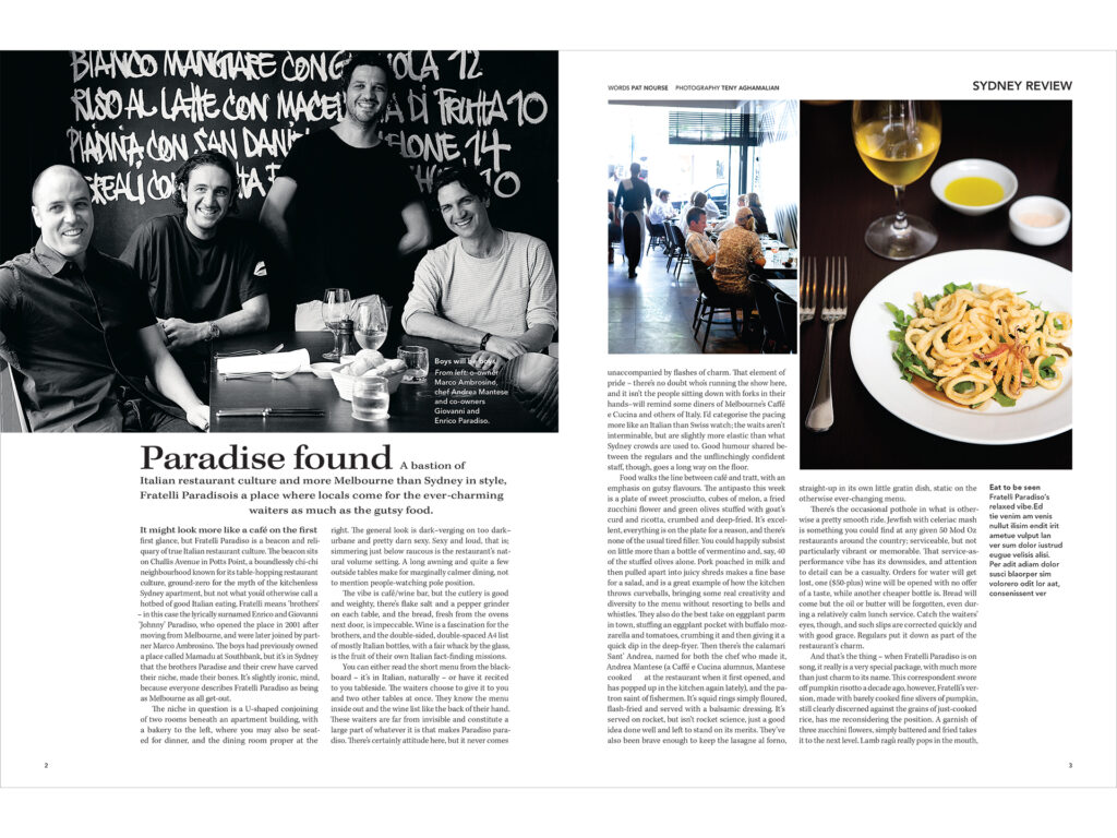
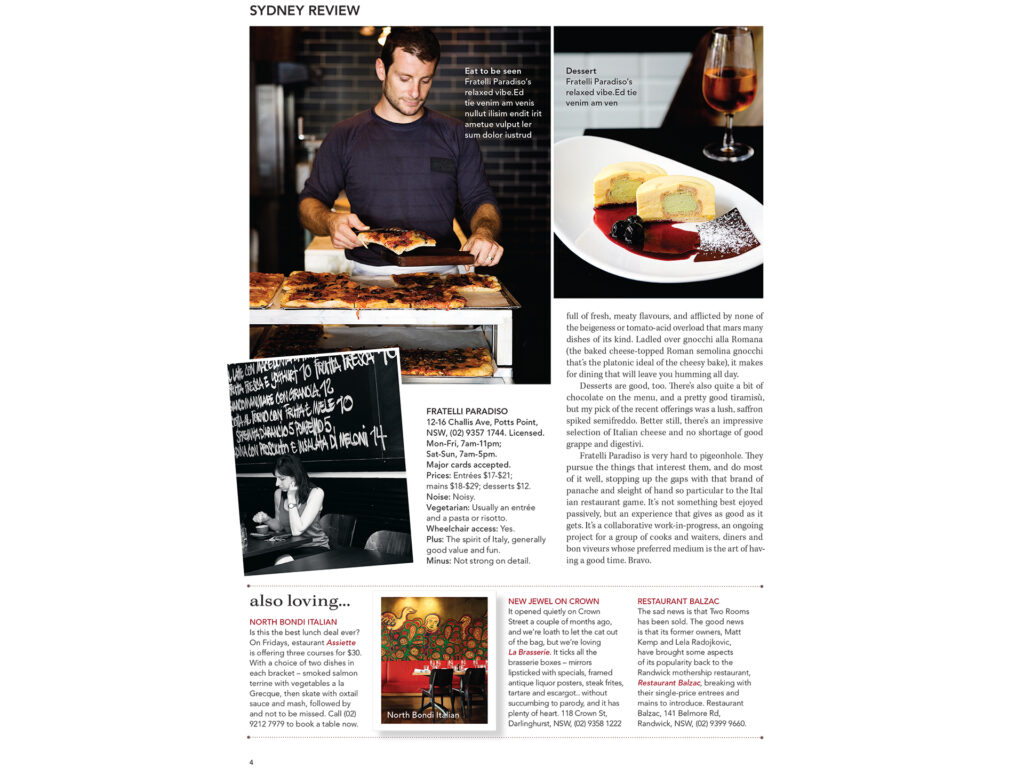
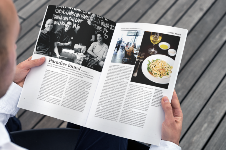
restaurant review editorial
This editorial piece was designed to showcase a restaurant review with a balance of sophistication and readability. Clean typography, thoughtfully placed pull quotes, and a strong grid structure guided the reader through the story, while full-color photography highlighted the dishes and atmosphere. The design created a modern, appetizing layout that elevated the dining experience on the page and captured the restaurant’s unique character.
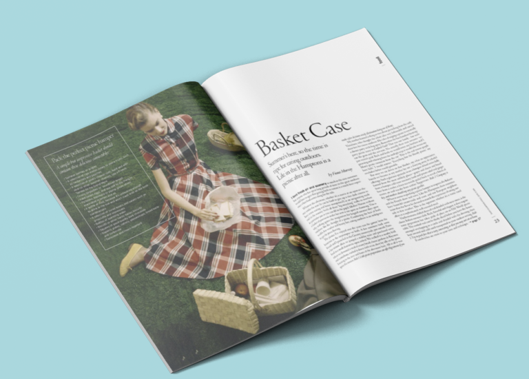
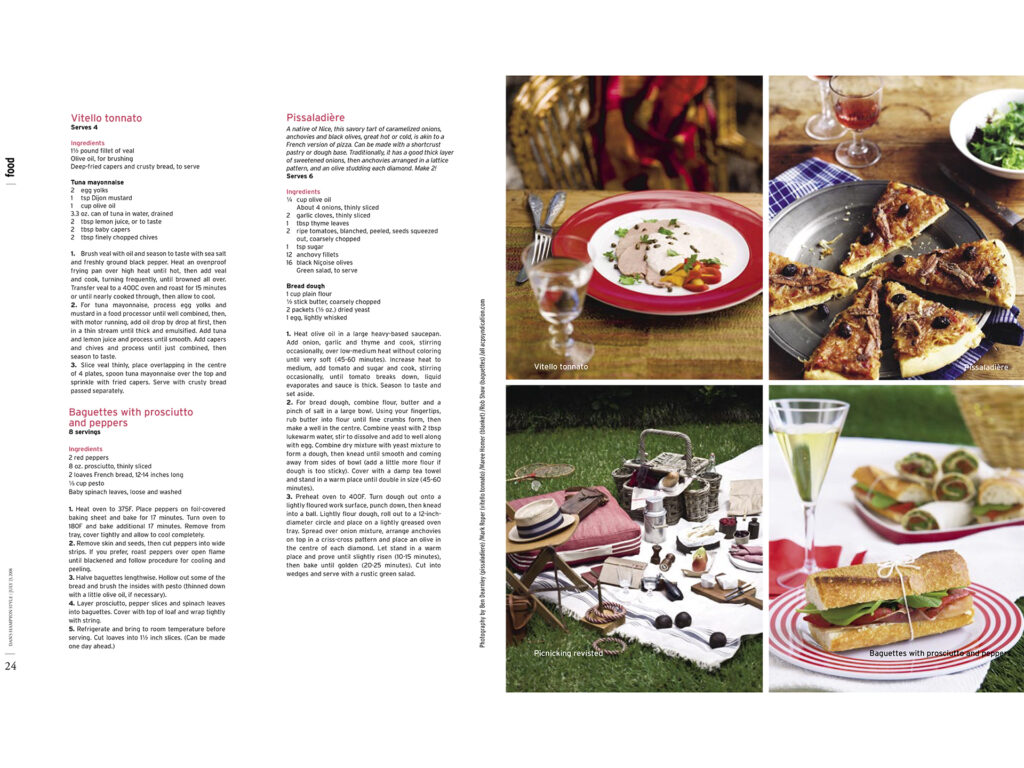
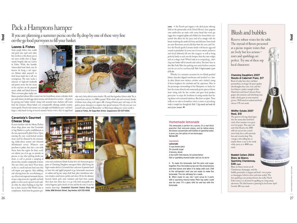
editorial on farm stands creating the perfect picnic
For the Basket Case editorial feature, I created a playful yet polished layout that visually echoed the theme through dynamic typography and carefully arranged imagery. By integrating woven textures, layered photography, and a light, airy composition, the design captured both the whimsy and sophistication of the concept. The result was a stylish, engaging spread that felt contemporary while maintaining a strong editorial edge.
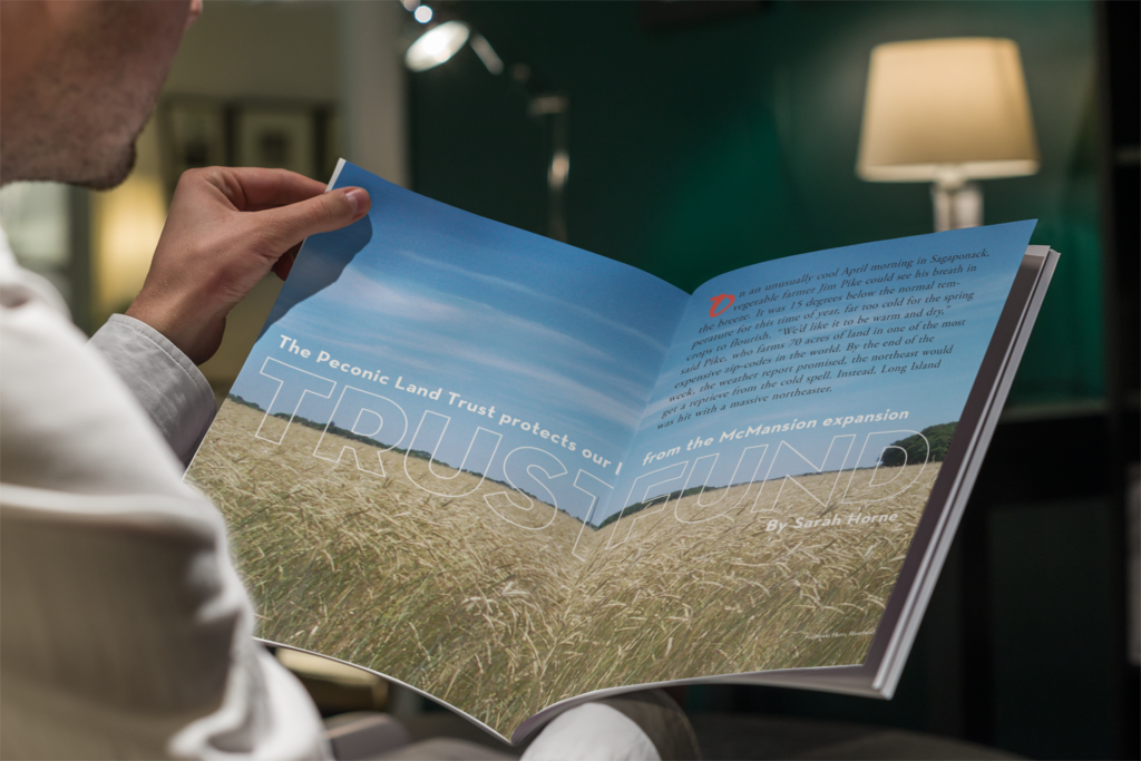
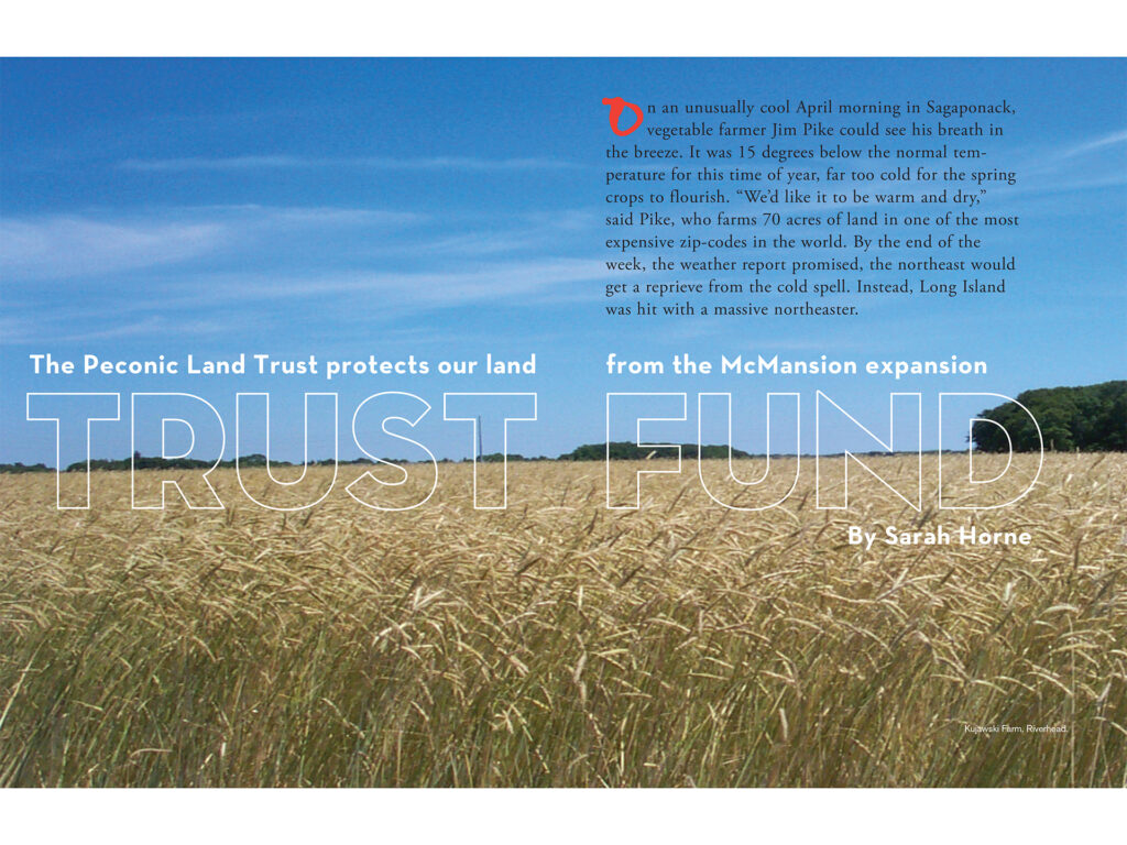
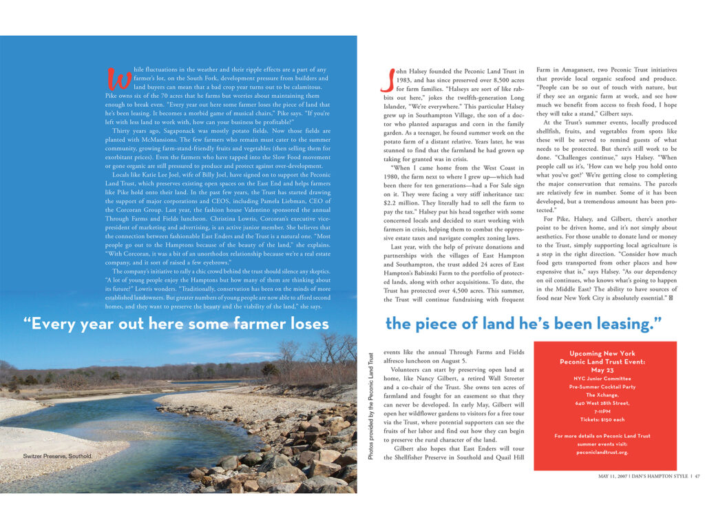
editorial on the peconic preservation trust
For this editorial feature on the Peconic Land Trust, I designed a layout that reflects the organization’s mission of preservation and stewardship. The piece combines earthy tones, spacious white space, and elegant typography with scenic photography of the East End landscape. The design strikes a balance between sophistication and approachability, giving readers a sense of both the beauty being protected and the importance of the Trust’s work.
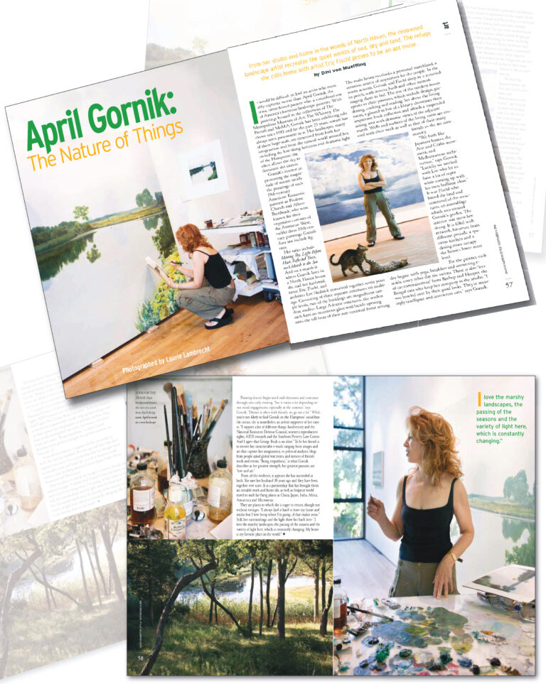
ali wentworth and april gornik features
The April Gornik feature took on a refined, gallery-like aesthetic. Using a lot of imagery, elegant typography, and full-bleed imagery when possible, the layout mirrored the expansiveness of her luminous landscape paintings.
In contrast, for the Ali Wentworth feature, I designed a lively, engaging layout that reflects her wit and charisma. Playful typography and bright, expressive photography brought her personality to life on the page, creating a spread that felt approachable yet polished.
Together, both designs showcase my ability to tailor editorial layouts to the unique voice of each subject while maintaining the elevated style of Hampton Style magazine.
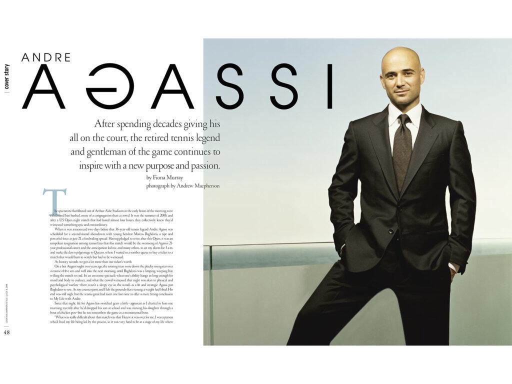
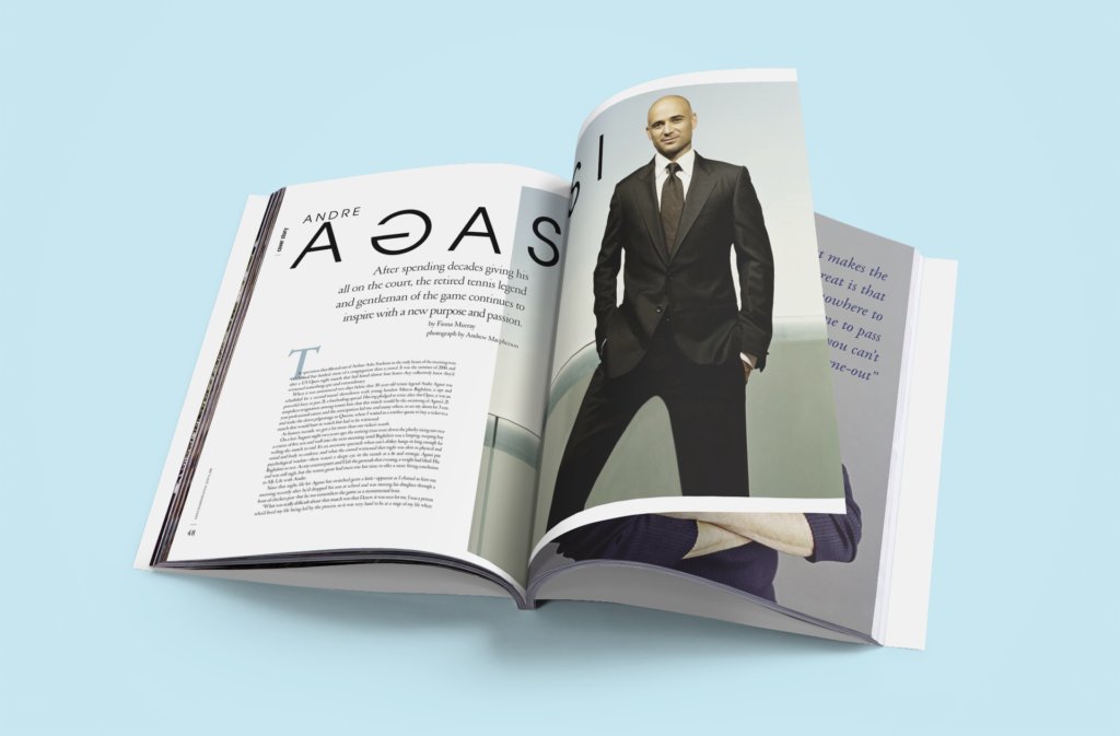
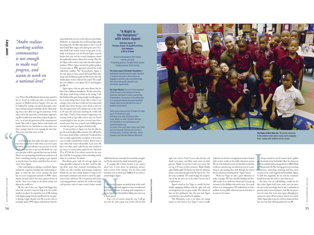
andre agassi feature
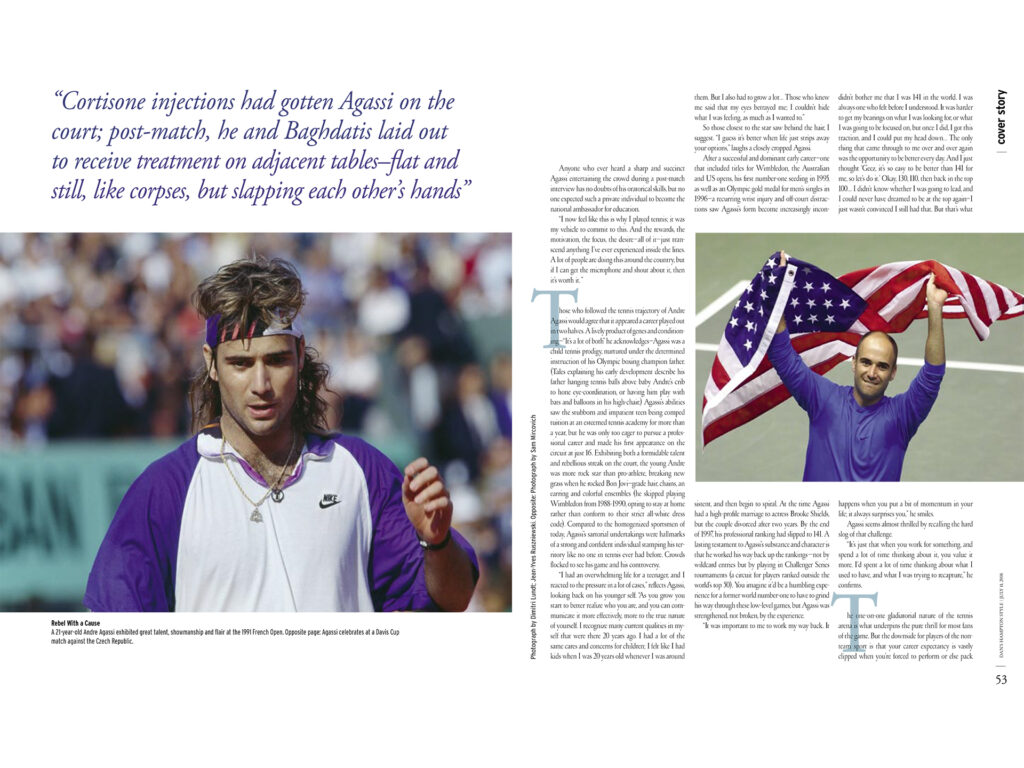
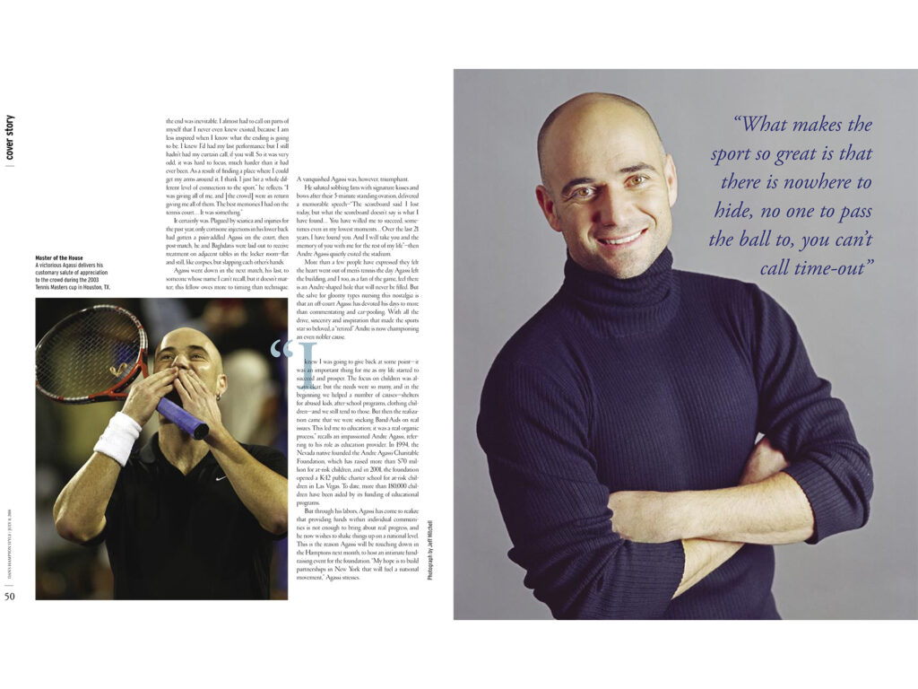
For the Andre Agassi feature, I created a bold and energetic layout that reflects both his dynamic career and strong personality. The design uses impactful typography, striking photography, and a clean grid structure to balance movement with sophistication. By combining modern styling with a sporty edge, the spread captures Agassi’s presence on and off the court while aligning with the magazine’s polished aesthetic.
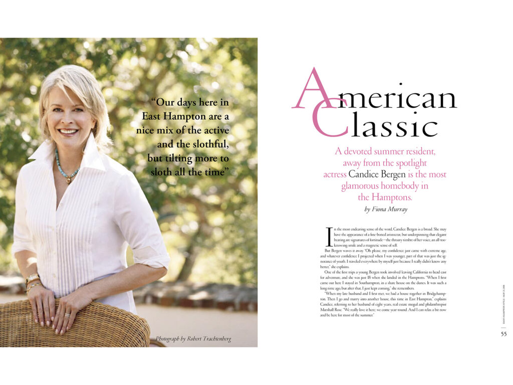
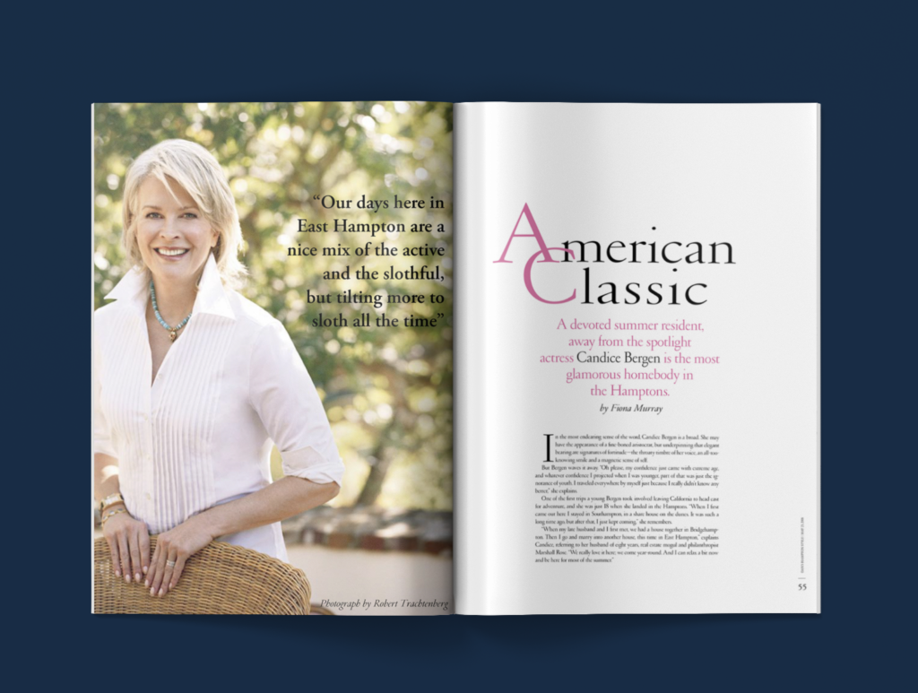
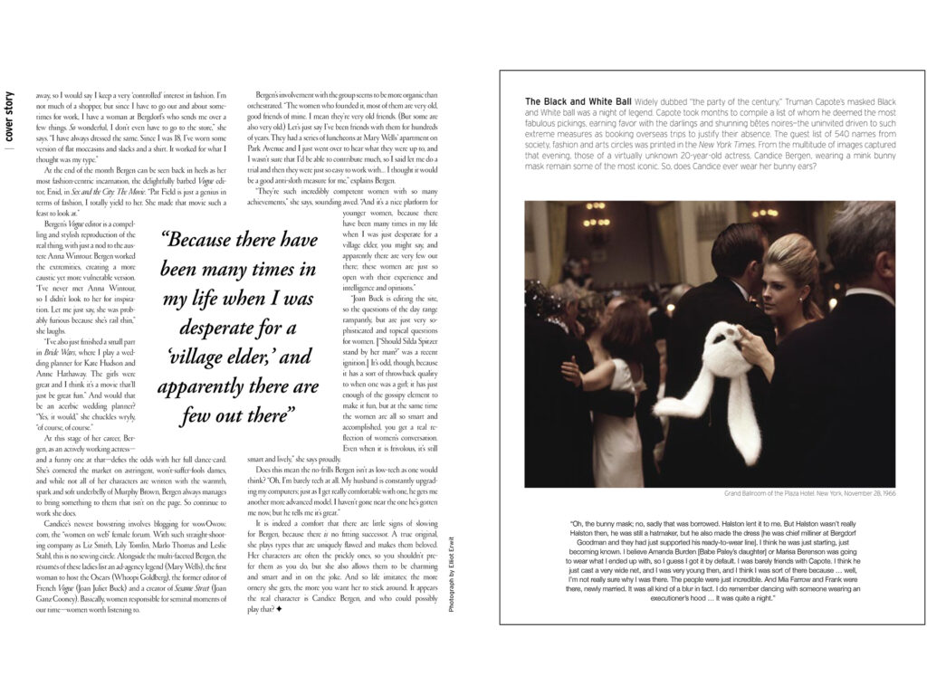
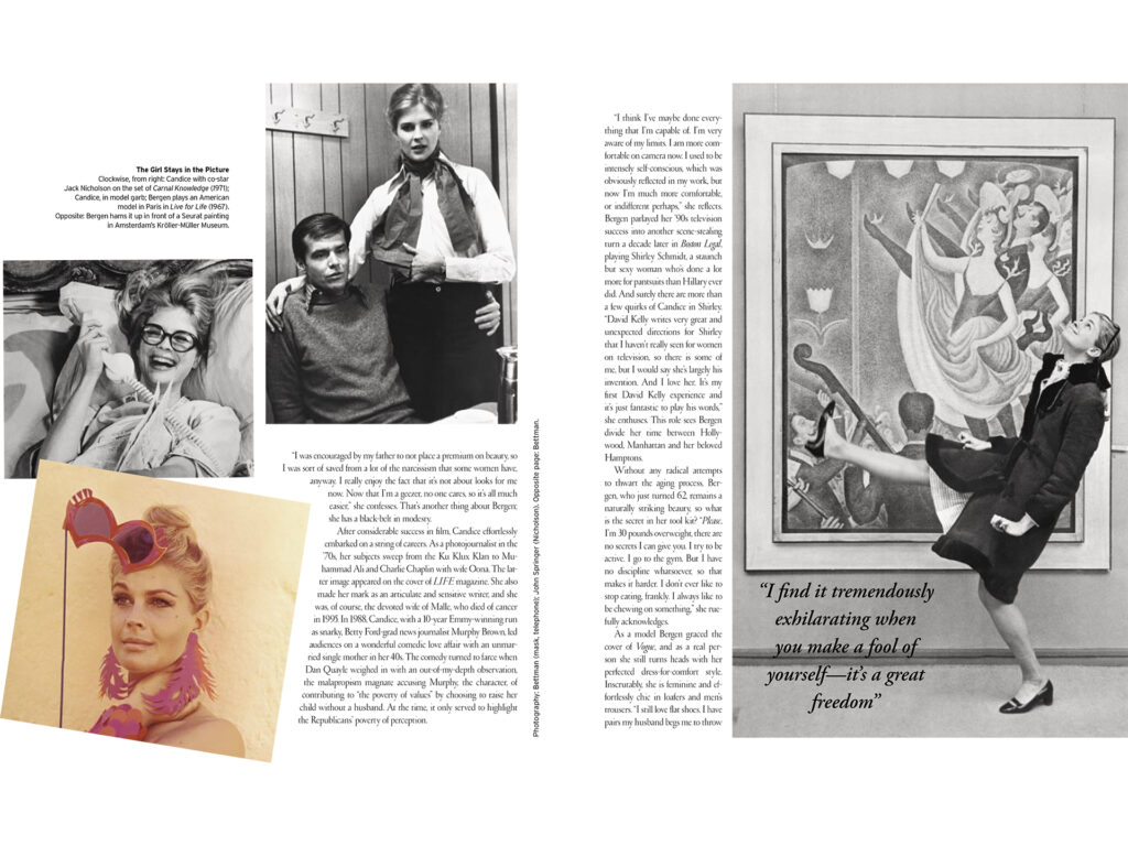
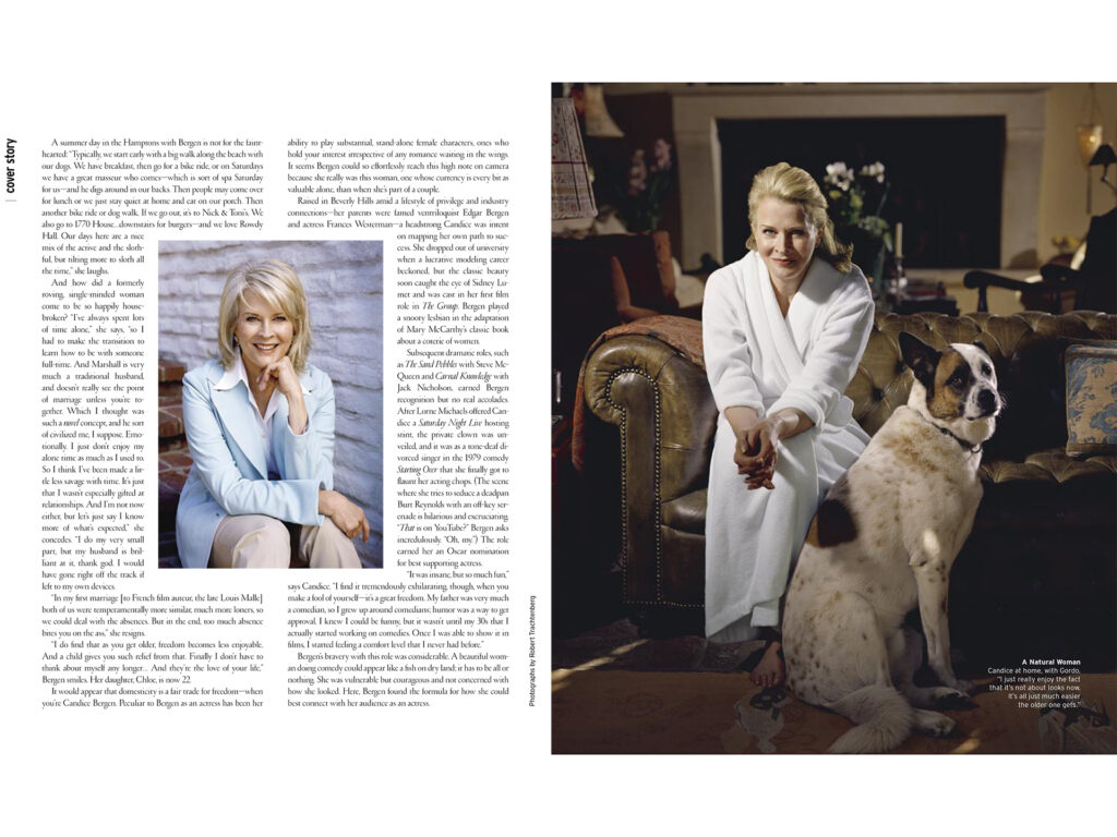
candice bergen feature
For the Candice Bergen feature, I designed an elegant, timeless layout that mirrored her iconic career and enduring style. Refined typography and carefully placed photography created a sophisticated, balanced spread that honored her presence and legacy.
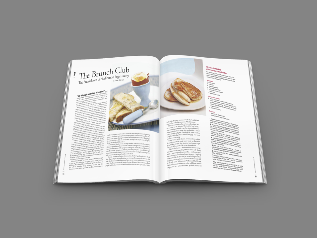
brunch editorial and recipes
This editorial spread for a brunch and recipes feature was designed to feel fresh, inviting, and appetizing. Clean typography, airy white space, and vibrant food photography worked together to draw readers in and highlight the dishes in an approachable yet polished way.
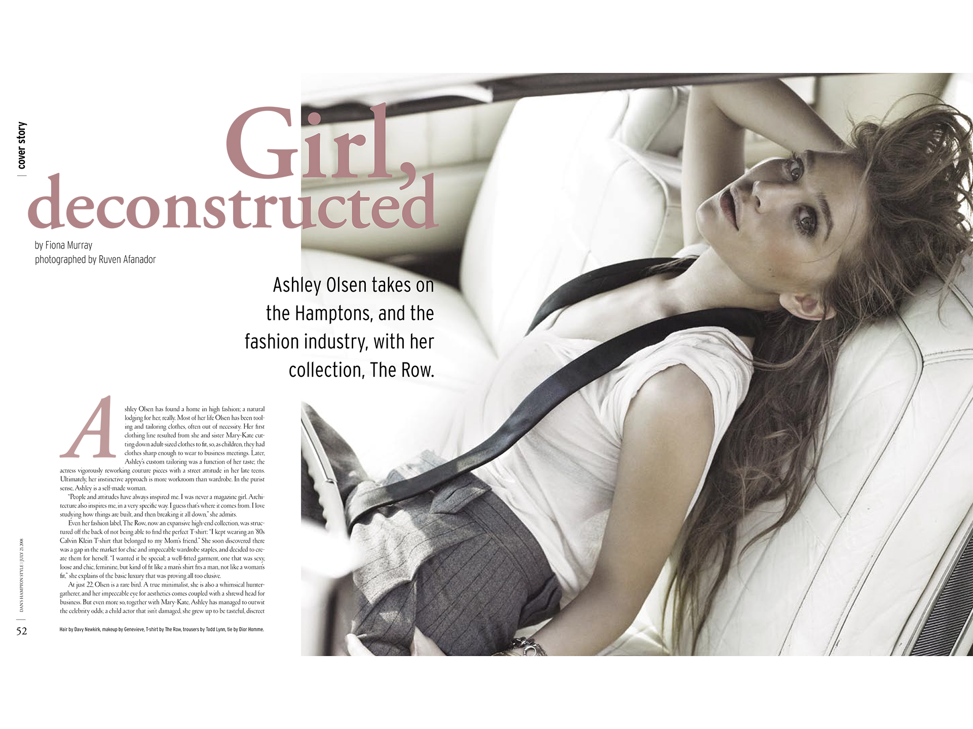
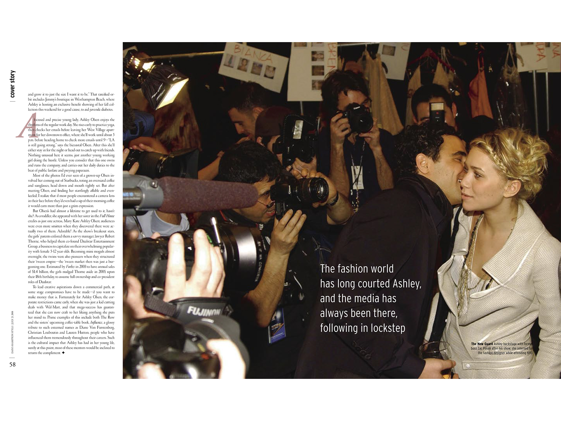
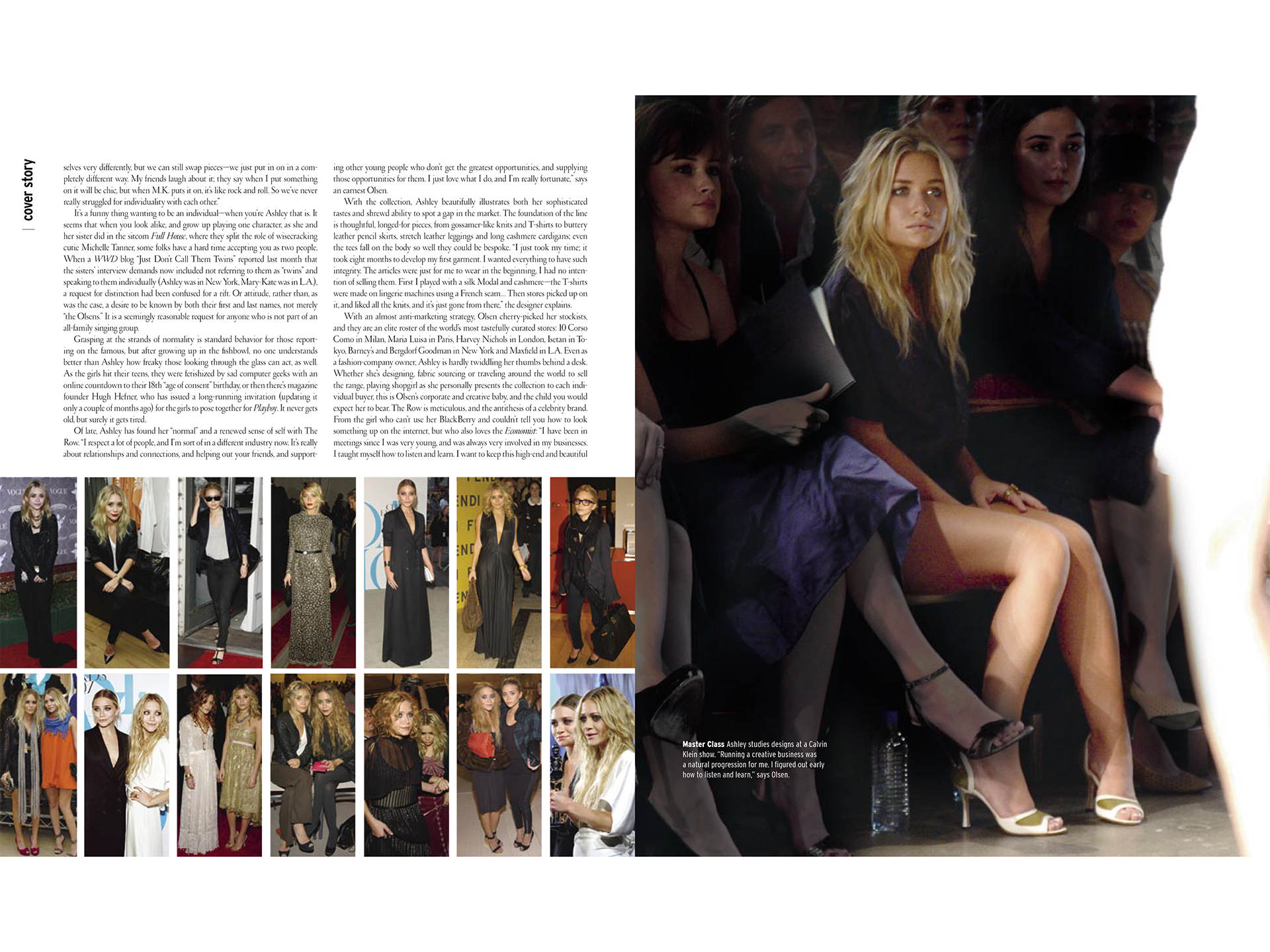
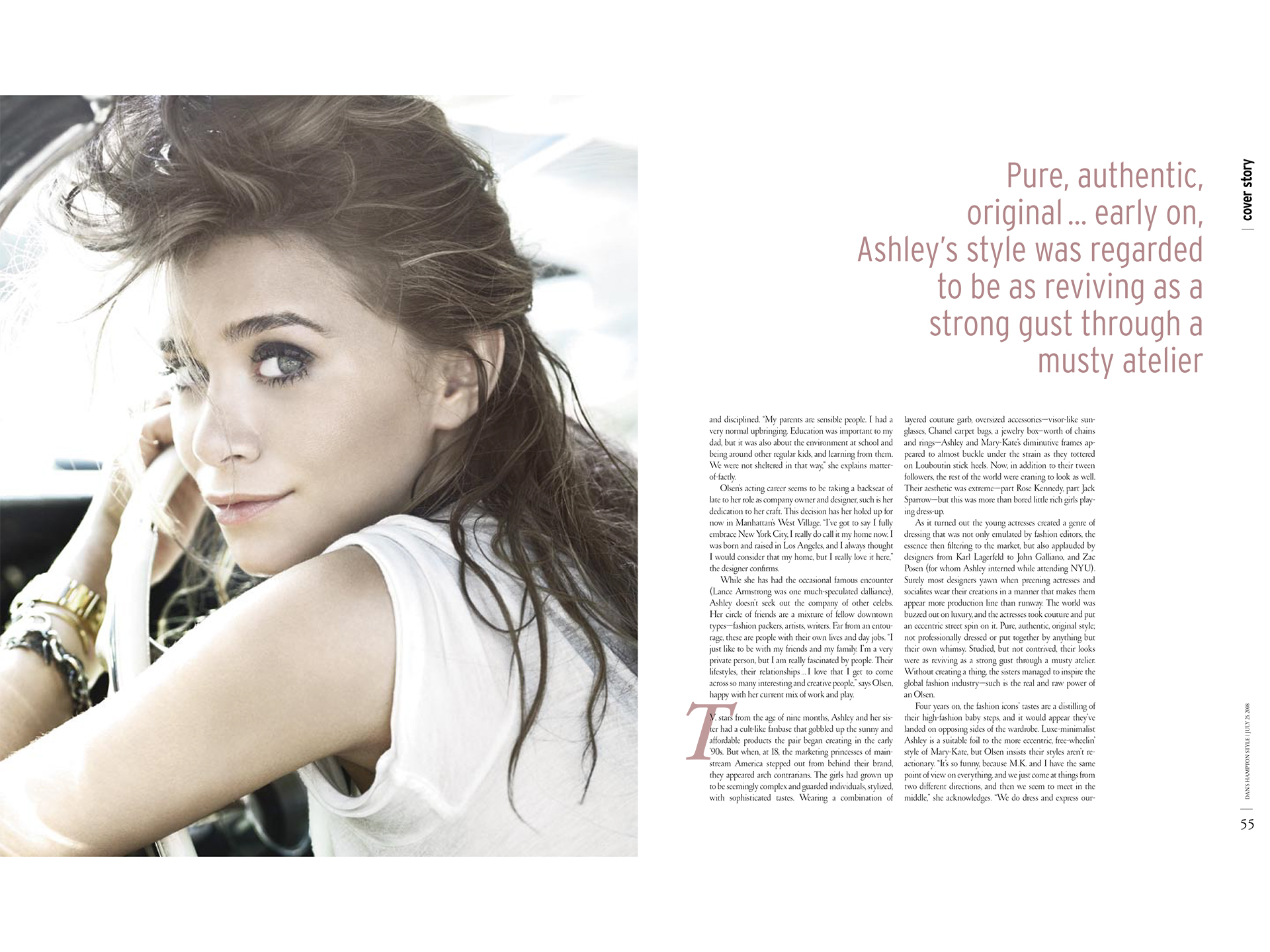
ashley olsen feature
For the Ashley Olden feature, I created a modern, stylish layout that showcased her vibrant personality and contemporary sensibility. Bold photography paired with sleek typography gave the spread a youthful, energetic feel while maintaining the magazine’s elevated aesthetic.