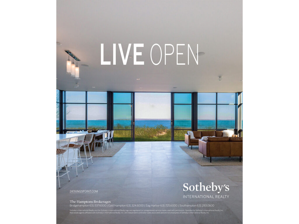
For the LIVE branding ad campaign, we developed a dynamic visual system that paired the bold word “LIVE” with aspirational lifestyle descriptors, such as LIVE COASTAL, LIVE OPEN, and LIVE HISTORIC. Each theme was supported by striking photography of Sotheby’s International Realty listings, from beachfront estates to light-filled modern homes, creating a flexible campaign that celebrated the many ways people live. The clean typography and sophisticated layouts reinforced the prestige of the brand while keeping the focus on lifestyle-driven storytelling.
abstractions - postcard design
I designed a promotional postcard for a gallery exhibition of abstract art, creating a bold and contemporary layout that echoed the energy of the work on display. Clean typography framed vibrant artwork reproductions, while a balanced composition ensured event details were clear and eye-catching. The design served as both an invitation and collectible keepsake, capturing the spirit of the exhibition in a compact format.
lifeboost coffee print ads
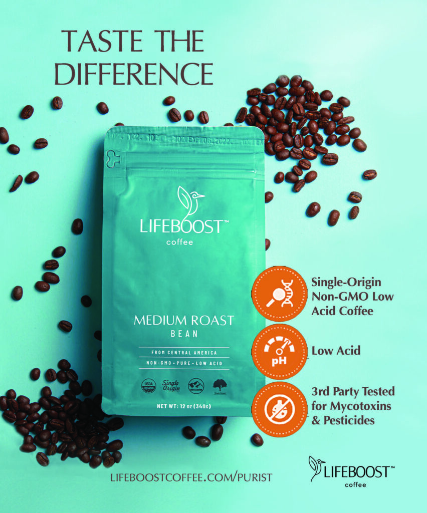
Lifeboost Coffee Print Ad – Aqua Blue and Coffee Grounds Theme Designed to spotlight Lifeboost as a premium, health-focused choice, this ad features bold teal packaging against a clean background. Scattered coffee beans add warmth and authenticity, while icon-driven callouts clearly highlight key benefits.
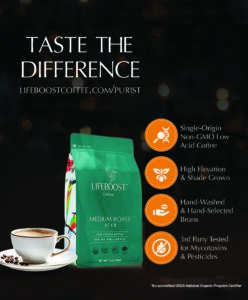
Lifeboost Coffee Print Ad – Dark Luminous Background and Coffee Cup Created to convey premium quality and trust, this ad uses a sleek dark background to highlight the teal packaging. A steaming cup of coffee adds warmth and approachability, while icon-based details communicate differentiators in a clear, eye-catching way.
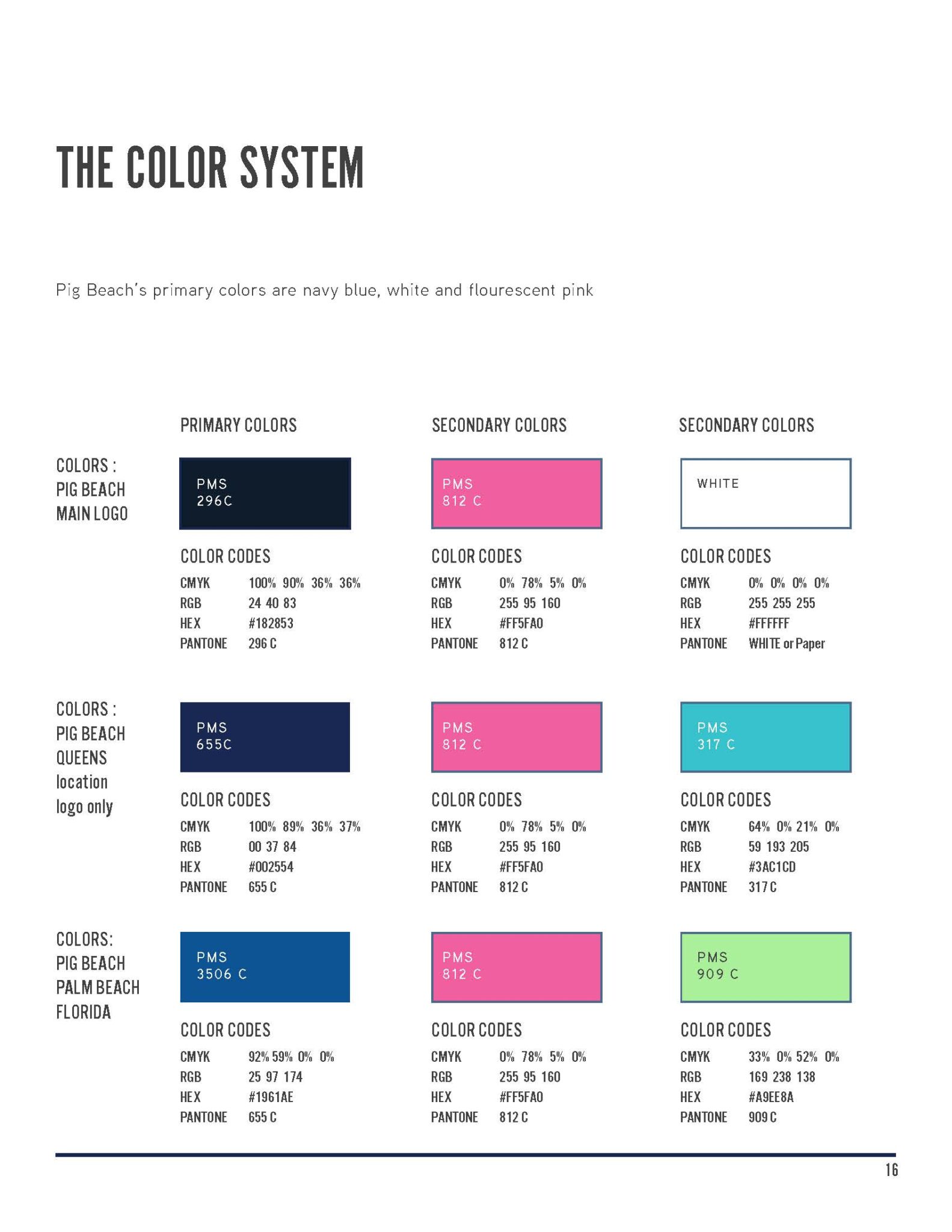
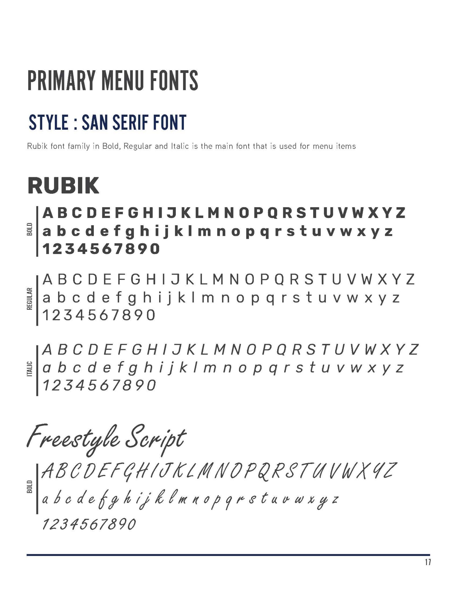
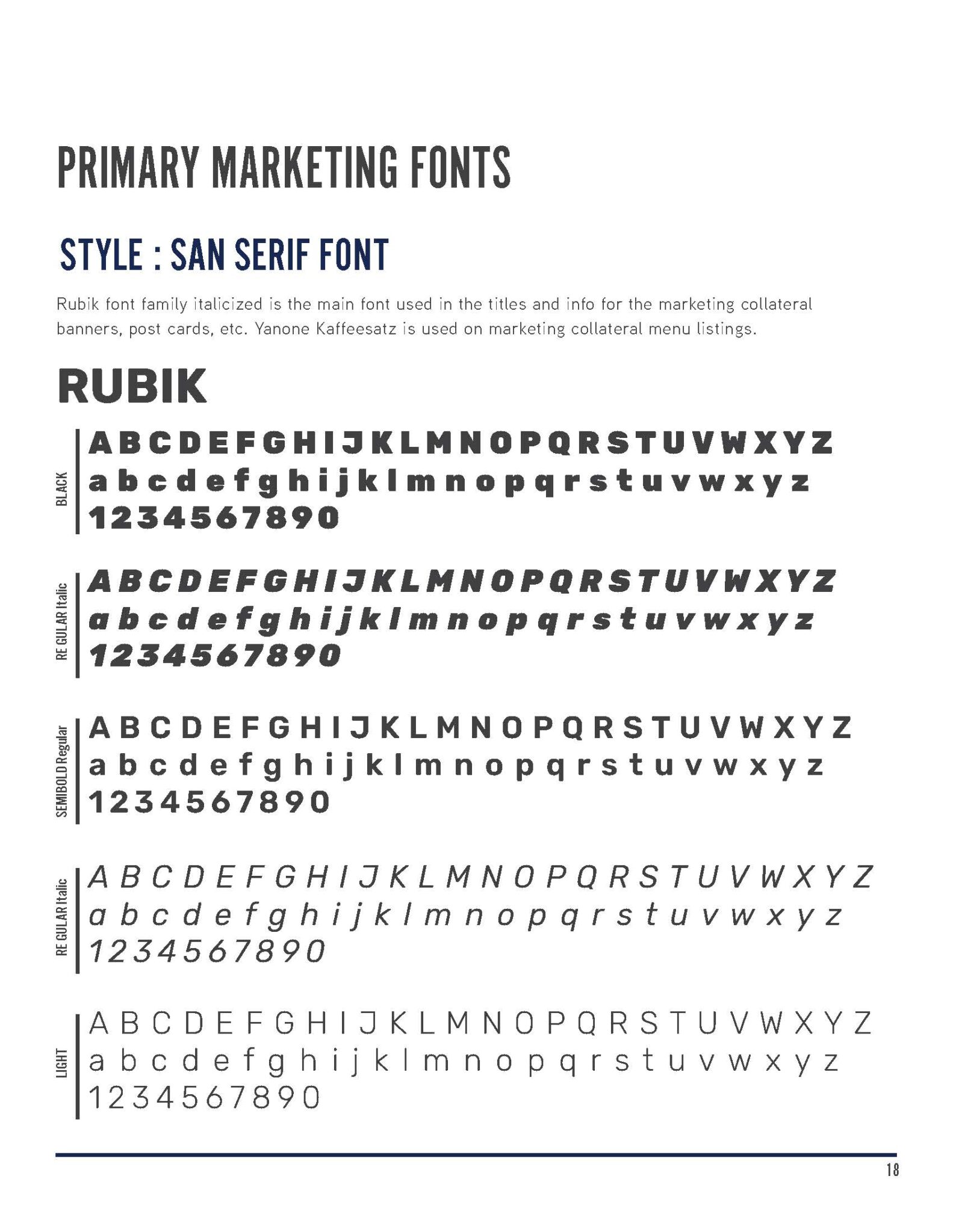
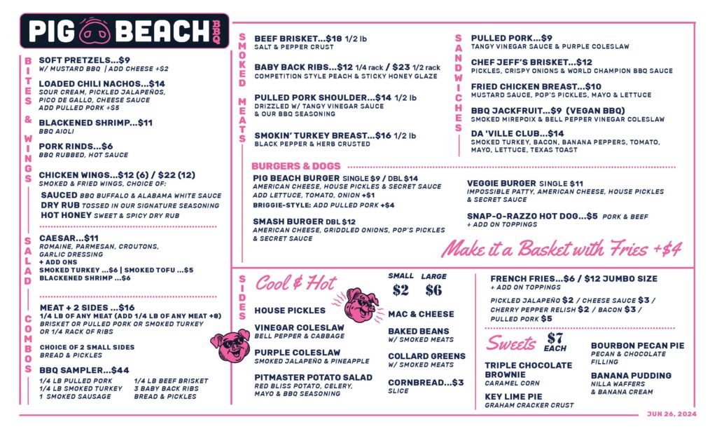
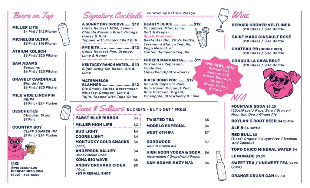
pig beach branding & style guide + menu design
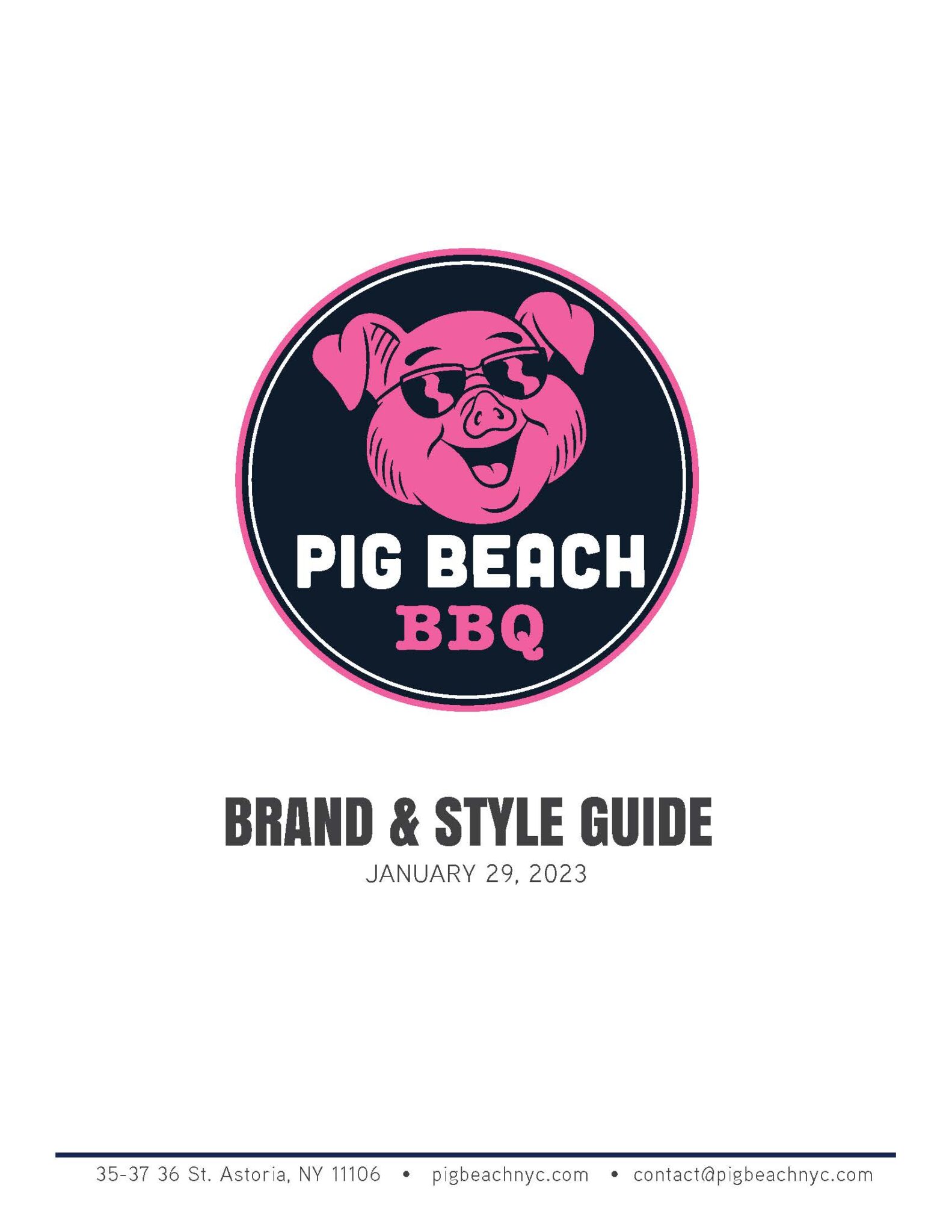
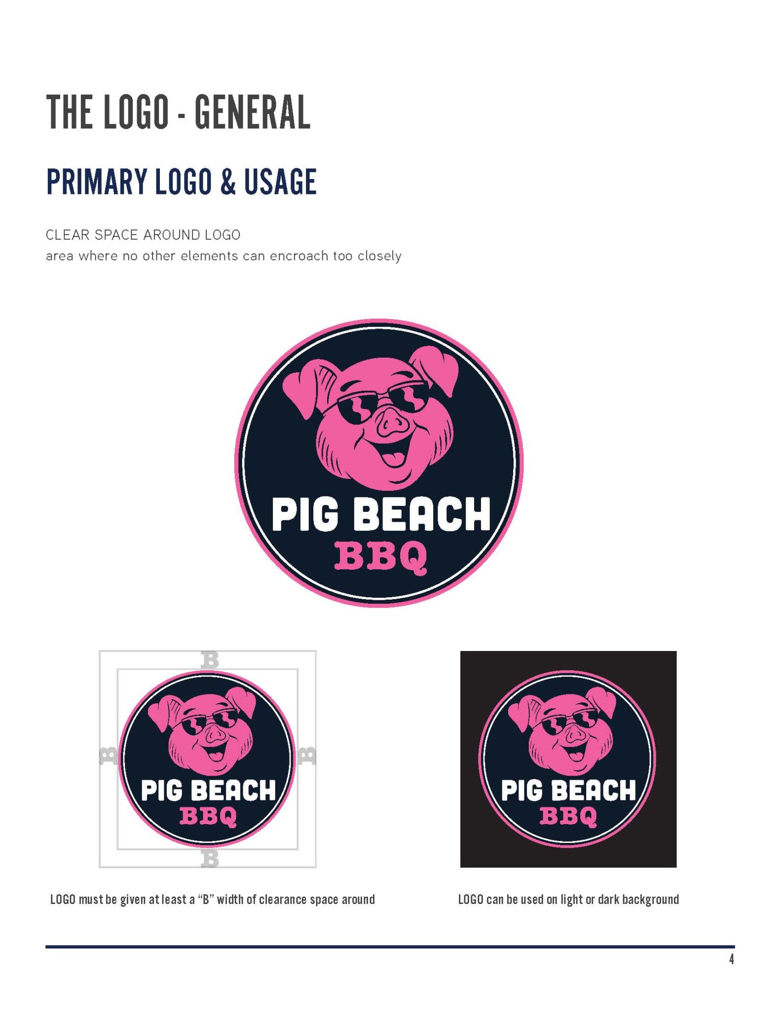
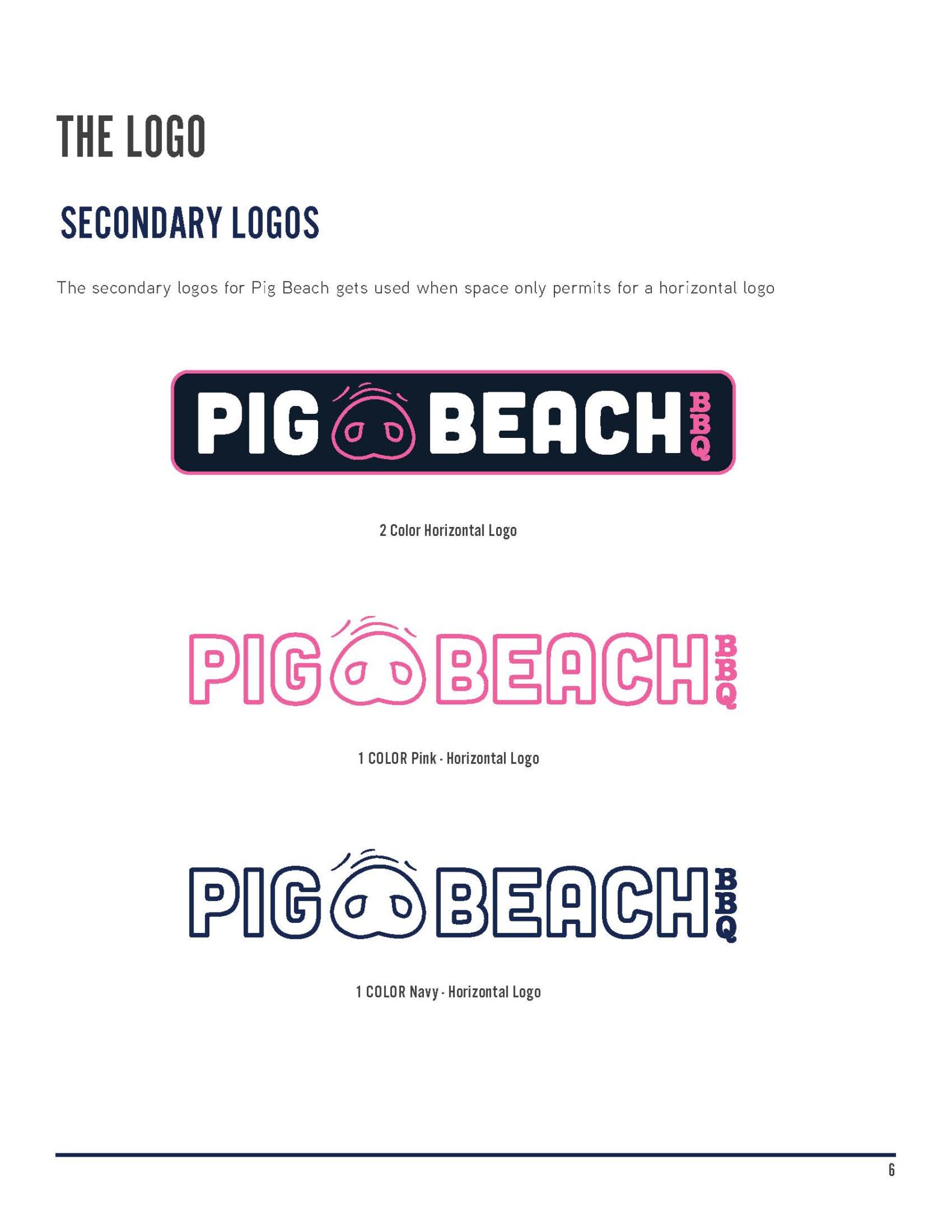
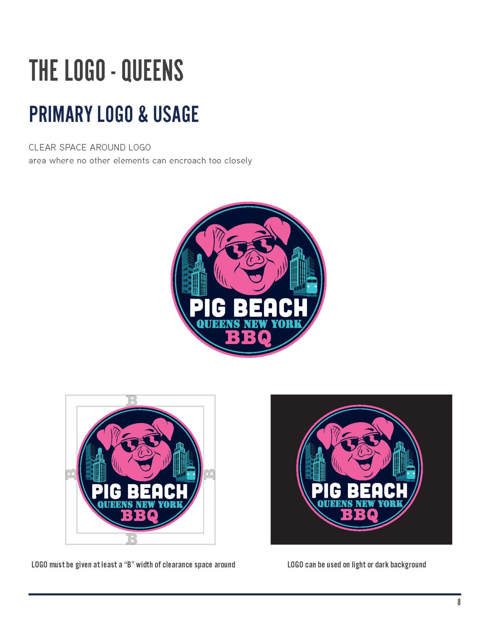
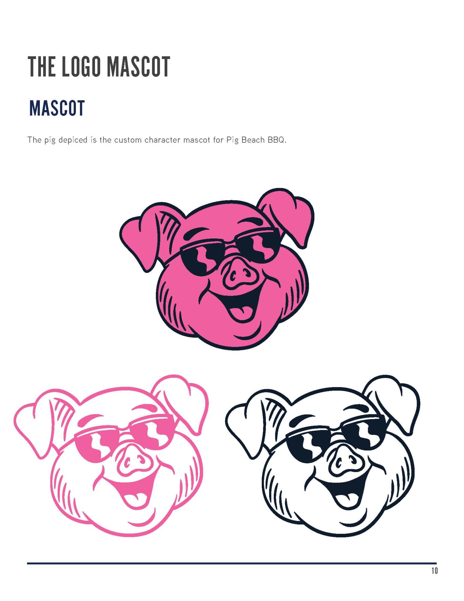
I developed the complete branding and style guide for a new BBQ-inspired restaurant in New York, infusing bold personality and modern energy into every detail. The identity pairs a vibrant navy blue and hot pink palette with strong typography and clean layouts, balancing rustic BBQ flair with a contemporary, urban edge. Building on this foundation, the Pig Beach BBQ menu design translates the brand into a lively, functional format. Vibrant pink accents, bold black typography, and a grid-based layout create clear hierarchy and easy navigation, while playful pig illustrations reinforce the brand’s character. Together, the branding and menu design establish a cohesive, distinctive identity that feels fun, approachable, and unmistakably New York.
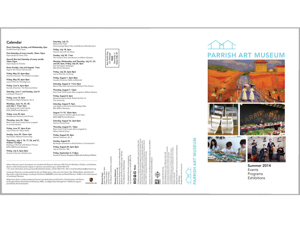
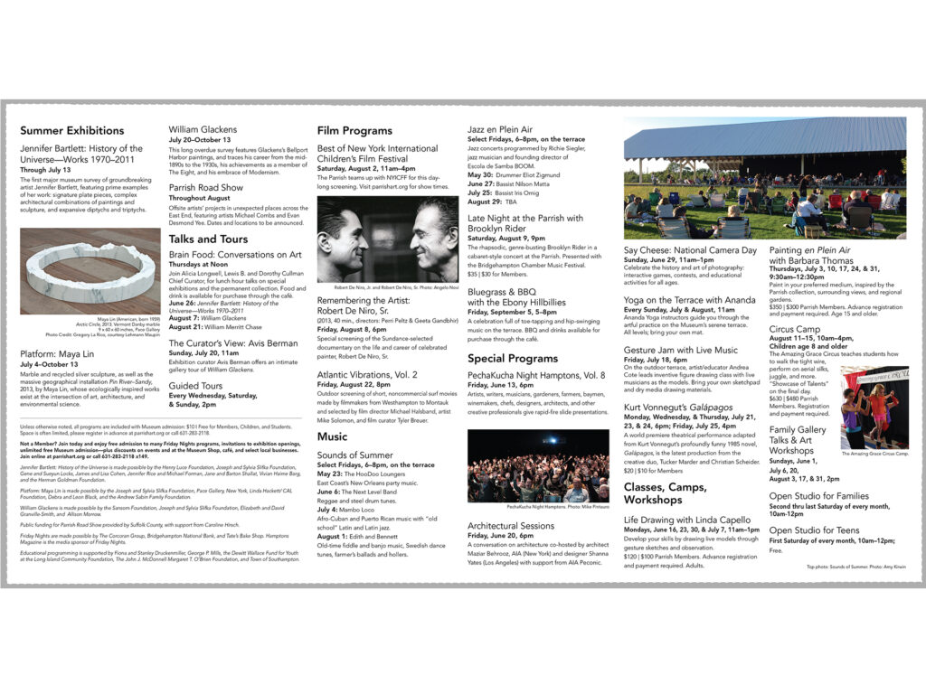
parrish art museum mailer
I designed a tri-fold mailer for the Parrish Art Museum to promote upcoming events and encourage membership renewal. The piece balanced clean, modern typography with engaging imagery to reflect the museum’s contemporary aesthetic while keeping the content clear and accessible. Thoughtful use of grids and hierarchy guided readers through event highlights, membership benefits, and key calls-to-action, making it both visually appealing and functional. The design served as a versatile communication tool, reinforcing the museum’s brand identity while inspiring recipients to stay engaged and connected.
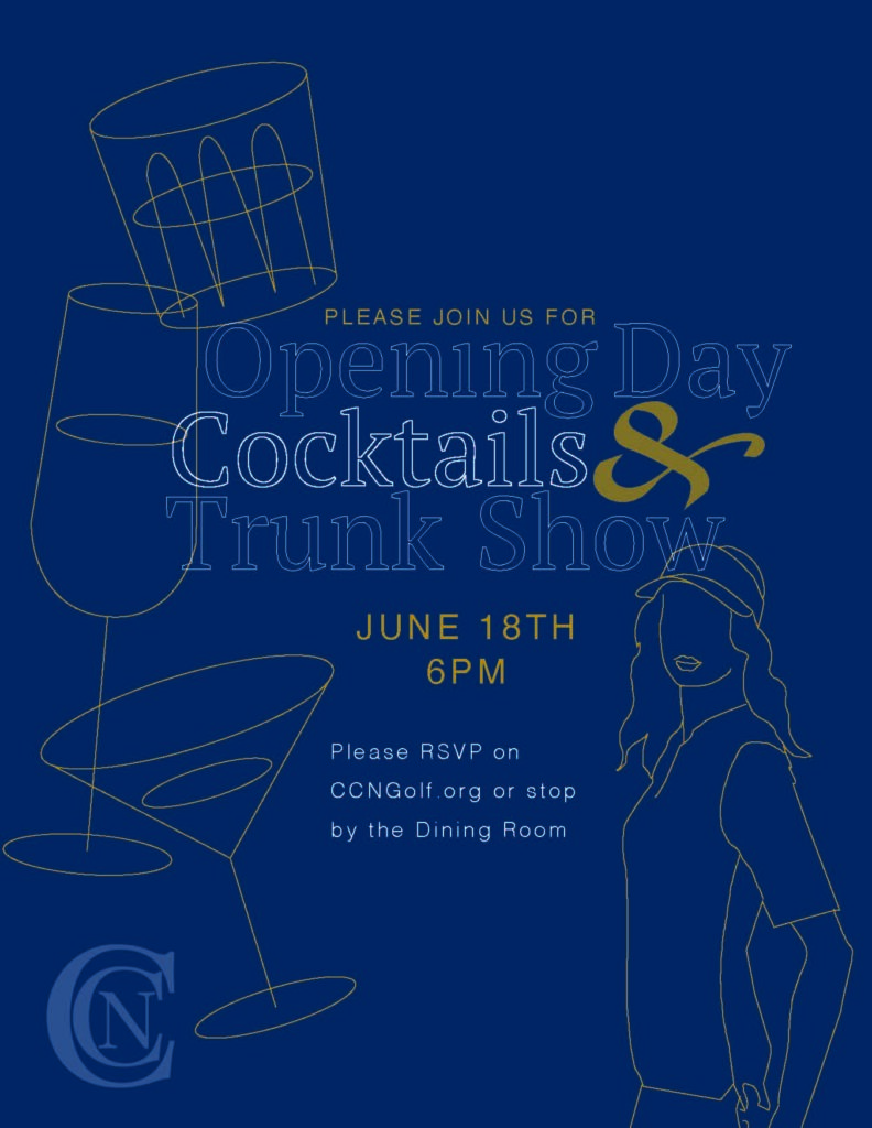
cape cod national golf club event and promotional design
I designed print and digital communications for Cape Cod National, including the Couples’ Club Championship, the Member Guest Fall Tournament, and numerous other seasonal events. Each piece balanced bold typography, dynamic graphics, and the club’s signature blue to engage members while maintaining brand consistency.
For TaylorMade Golf Clubs, I created a promotional announcement for the sleek P.790 iron, using bold typography and a striking red-and-black gradient to convey a premium, performance-driven feel. Clean layouts ensured details were clear across both print and digital platforms.
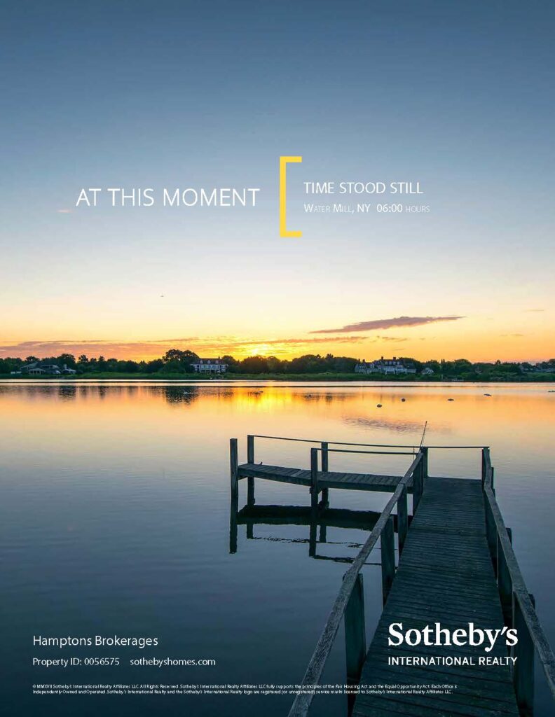
at this moment branding ad campaign for sotheby's
Conceptualized the At This Moment branding campaign for Sotheby’s International Realty, shifting the focus from property images to the lifestyle and scenery that make each location desirable. Featuring evocative photography of local landscapes, culture, and everyday moments, the campaign captured the emotional connection of why people choose to live in a place rather than simply showcasing the homes themselves. Clean typography and refined layouts tied the visuals together, reinforcing Sotheby’s prestige while telling a more personal, aspirational story.
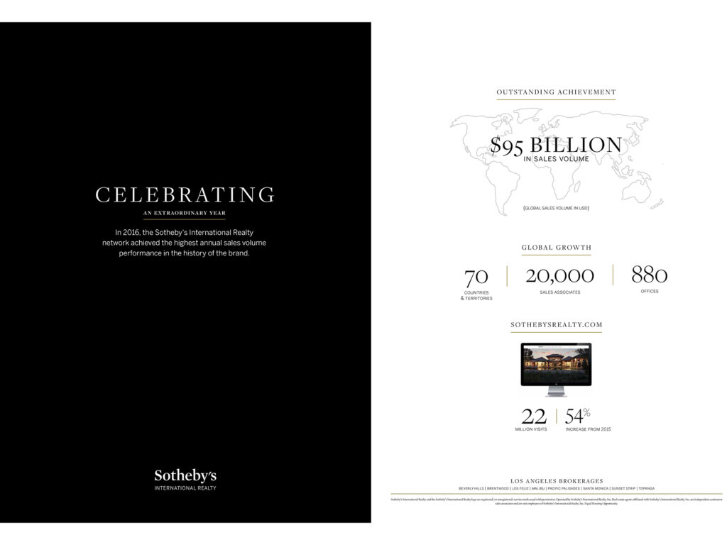
end-of-year branding spread ad
I designed a clear, clean layout to celebrate Sotheby’s International Realty’s end-of-year numbers. Using a striking black-and-white palette for contrast, the piece highlighted key statistics with bold typography and structured layouts, creating a sophisticated, high-impact design that reflected the brand’s prestige while keeping the focus on the numbers.
pitch presentation for agents
I designed a polished pitch presentation for agents to use in client meetings, helping them present both themselves and Sotheby’s services with confidence and clarity. The deck combined sleek layouts, refined typography, and strong visual hierarchy to highlight market expertise, brand prestige, and tailored client offerings. Structured for impact and ease of use, the design positioned agents to put their best foot forward and effectively communicate the value of partnering with Sotheby’s International Realty.
Click image for FLIPBOOK
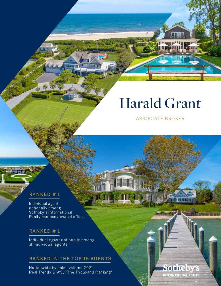
top agent brochure
I designed a unique and personalized brochure for top agent Harald Grant, showcasing his prestige, expertise, and distinguished portfolio of properties. The layout combined refined typography, elegant imagery, and bespoke design details to reflect his personal brand while aligning with Sotheby’s luxury identity. This tailored piece served as both a marketing tool and a statement of professionalism, reinforcing his position as a leading agent in the marketplace.
Click image for FLIPBOOK
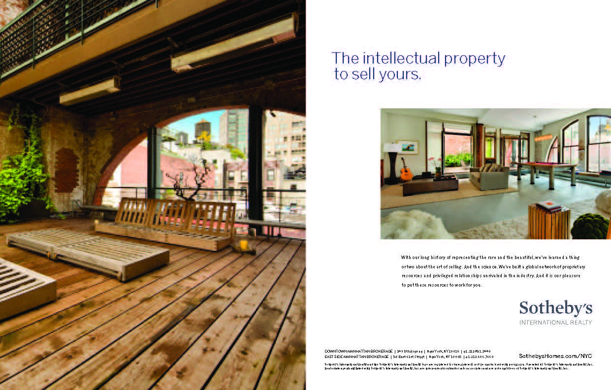
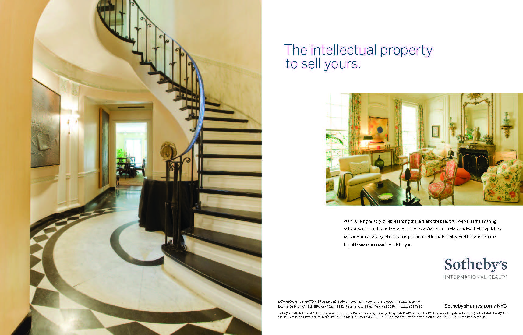
significant sales ad & other branding campaigns for sotheby's
Click GALLERY to see Larger
Significant Sales Branding Ad Designed to showcase Sotheby’s record of extraordinary transactions with clean layouts, bold typography, and refined imagery, reinforcing the brand’s global prestige.
Only With Us Campaign A campaign highlighting the exclusive advantages of Sotheby’s, using striking visuals and concise messaging to emphasize access, expertise, and unique opportunities available only through the brand.
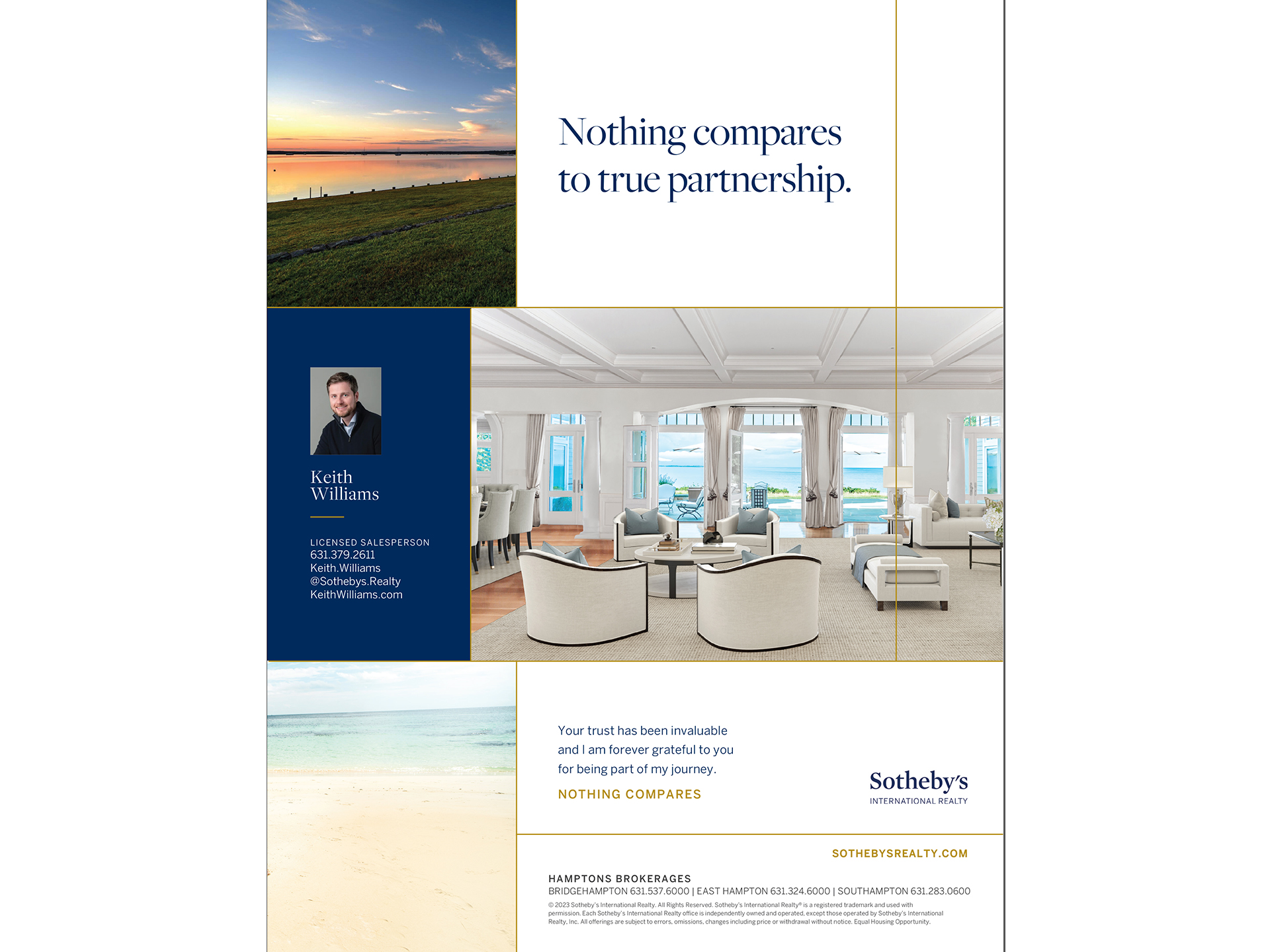
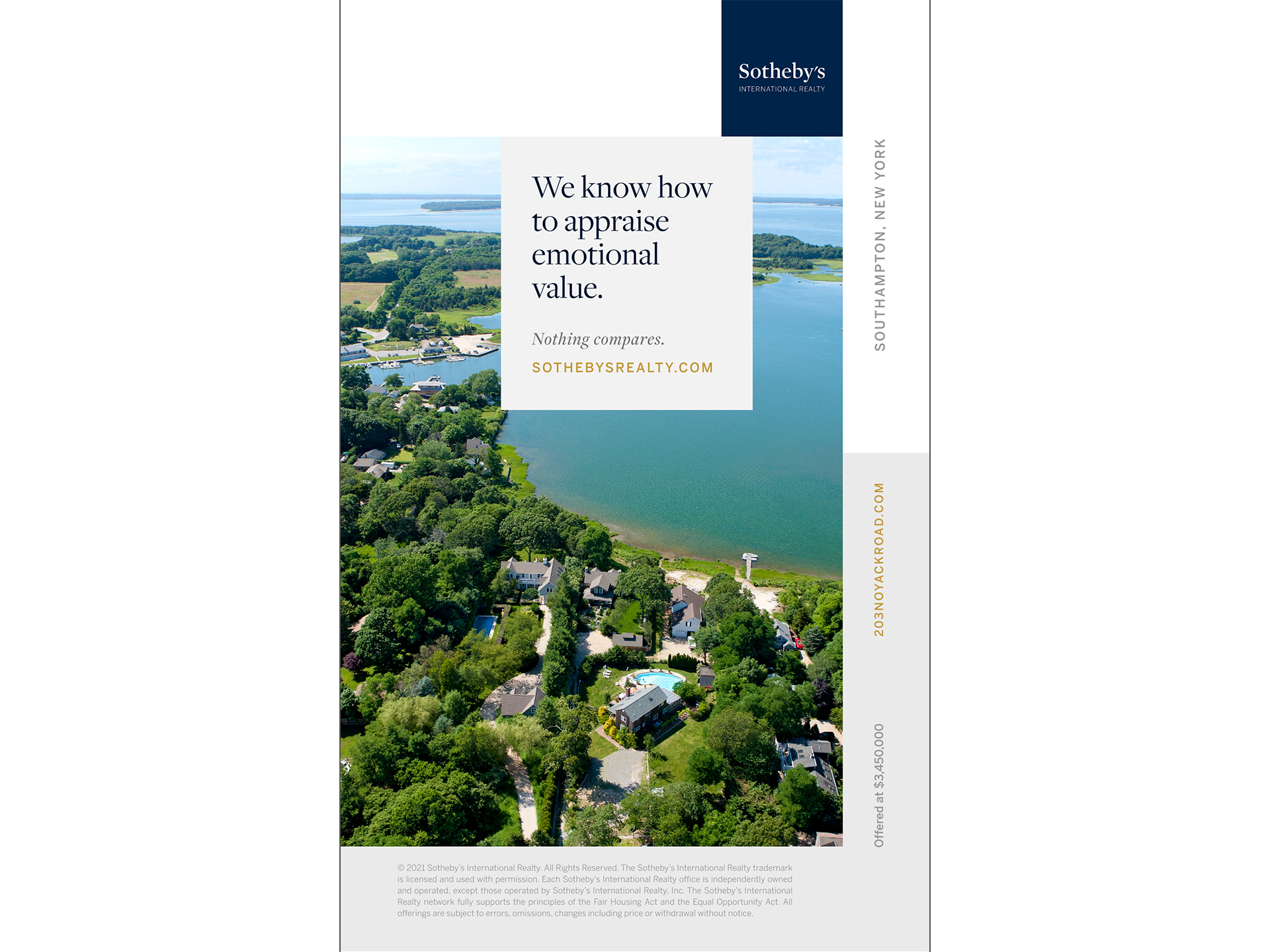
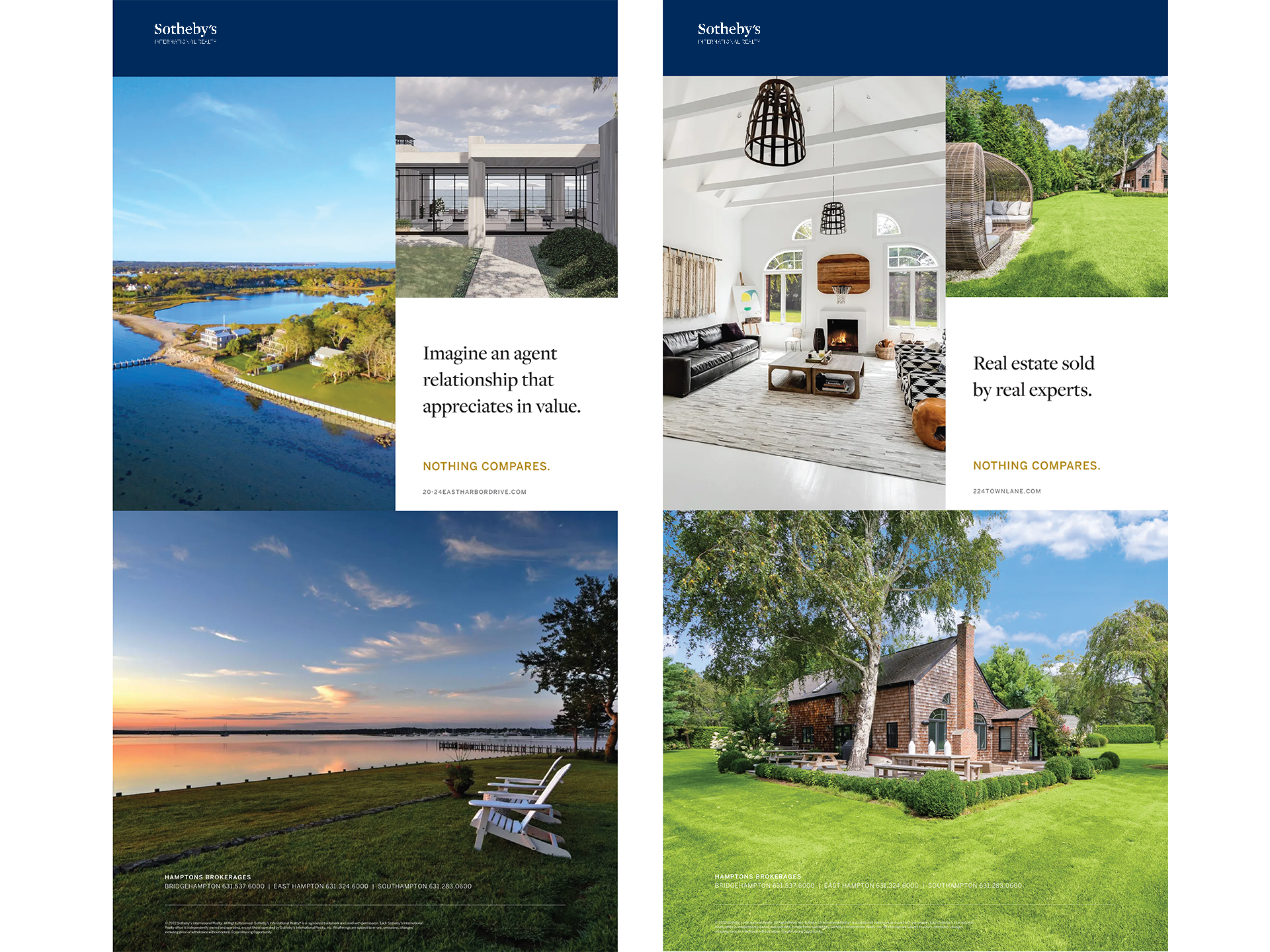
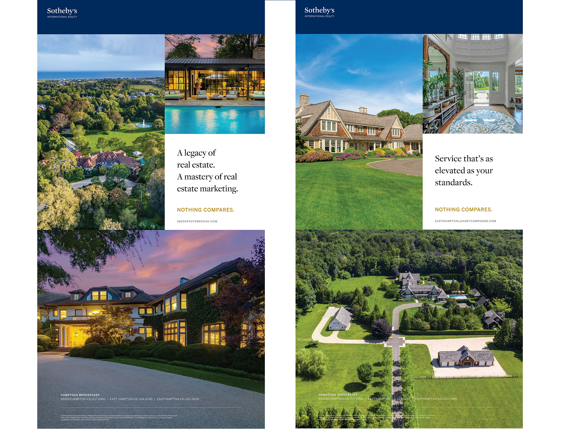
Nothing Compares Campaign Celebrated Sotheby’s unmatched position in the market with elegant design and aspirational messaging, underscoring the brand’s singular ability to represent extraordinary properties.
Lucidpress
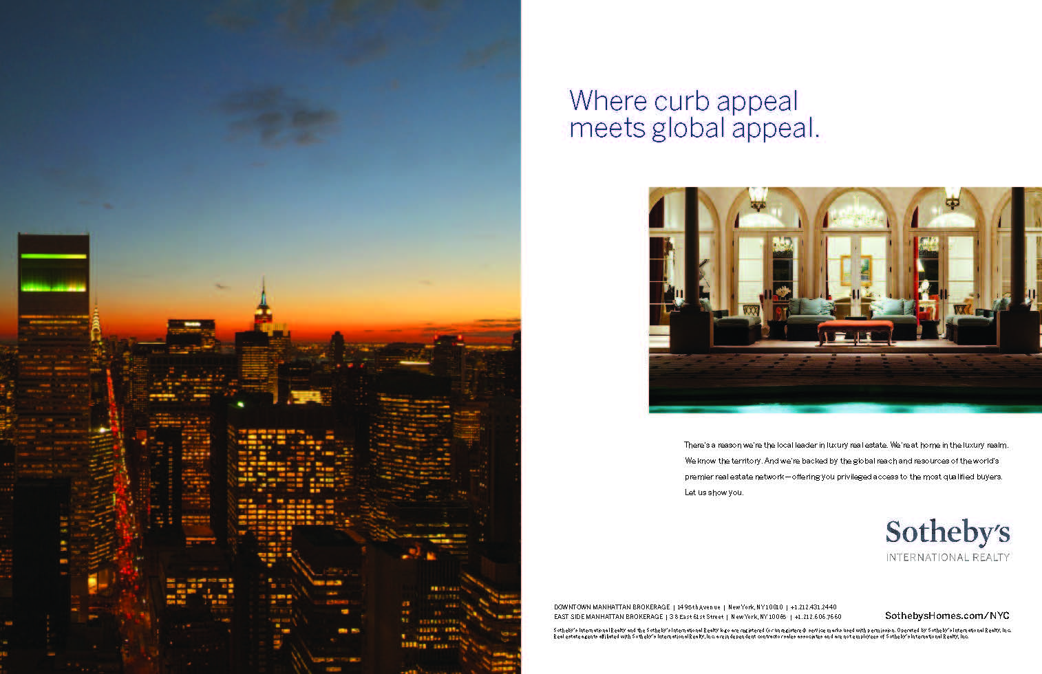
sotheby's branding ad campaign
Click GALLERY to see Larger
One of the first branding campaigns I created for them was designed to highlight their elevated elegance and luxury, setting the brand apart from other up-and-coming companies. The campaign incorporated bold taglines like “We have no B list” to reinforce exclusivity and sophistication, establishing a distinct voice that aligned with their prestige and market positioning.
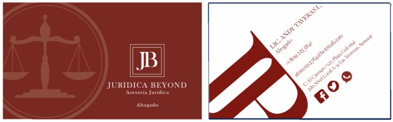
branding and business collateral for law firm
I developed the branding and business card design for Juridica Beyond, a forward-thinking law firm. The identity combined modern typography, a clean layout, and a sophisticated color palette to convey professionalism with a contemporary edge. The business cards extended this visual language, offering a sleek, memorable first impression that reflected the firm’s innovative approach to legal services.
vine street cafe piri piri sauce label
I designed the packaging label for Vine Street Café’s house-made Piri Piri Sauce, using the owner’s father’s name (Carl Mack), and drawing inspiration from Mediterranean and Moroccan aesthetics. The design features warm, spiced tones and intricate pattern-inspired elements that evoke the sauce’s origins, while maintaining a clean, modern layout. The result is a label that feels artisanal and exotic yet polished, perfectly reflecting the restaurant’s coastal sophistication.
vine street cafe pier pier sauce label
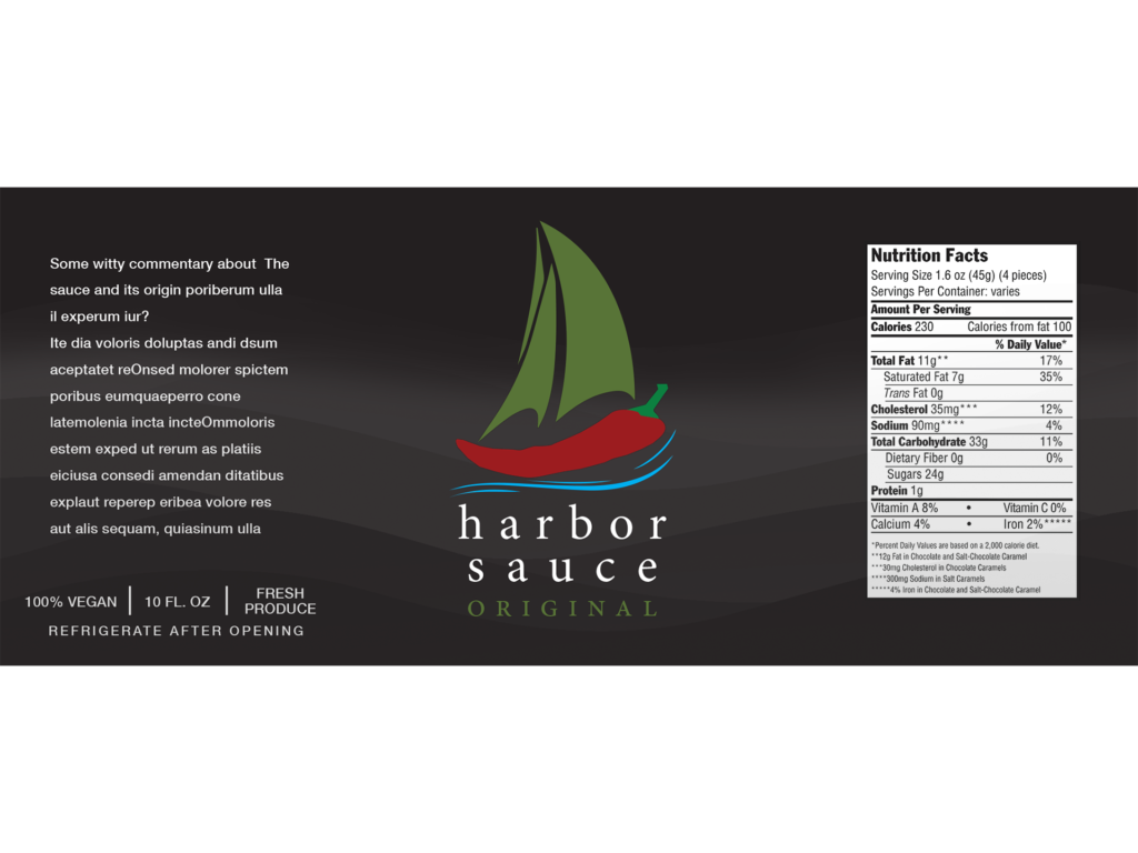
For Chef Matty Boudreau’s Harbor Hot Sauce, I crafted a bold, flavorful design that mirrors the sauce’s vibrant personality. Strong typography, dynamic color, and a handcrafted feel make the label stand out while staying true to the chef’s creative, small-batch culinary vision.
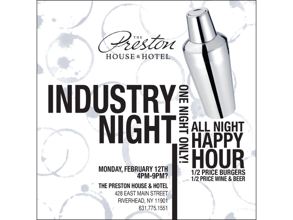
preston house menu designs
I designed a full suite of collateral for Preston House, creating a cohesive brand experience that extended across menus, signage, and printed materials. The design reflects the restaurant’s refined yet approachable atmosphere, using clean typography, subtle textures, and a sophisticated color palette. Every piece, from wine lists to event materials, was crafted to align with the Preston House logo and identity, ensuring consistency and elegance at every guest touchpoint.
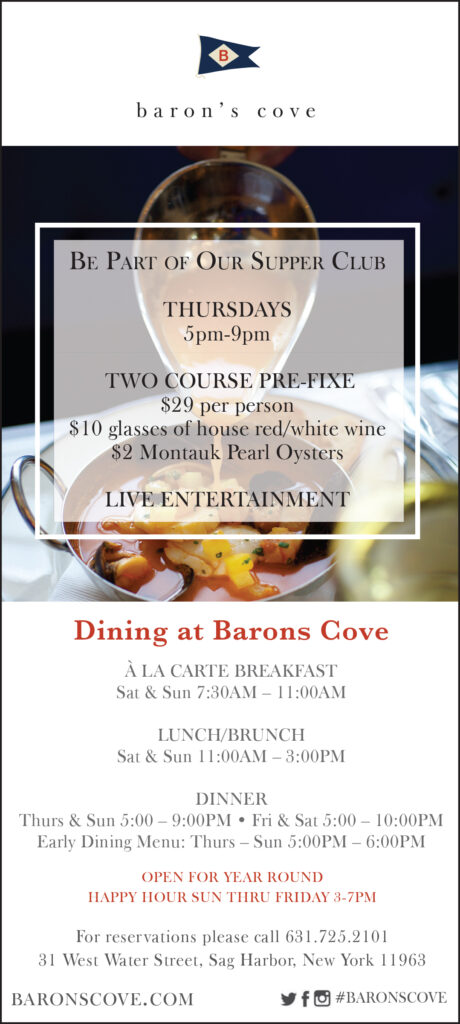
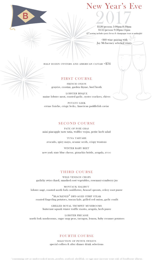
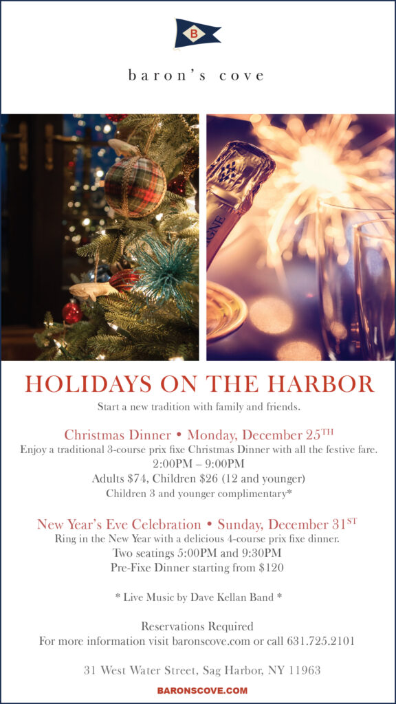
barons cove collateral
I designed menus and print advertisements for Baron’s Cove, a boutique restaurant and hotel, creating a cohesive visual identity that reflects its coastal charm and upscale appeal. The menus balanced clean typography with subtle nautical accents, ensuring both readability and elegance for guests. Complementing this, the print ads showcased the property’s lifestyle and dining experiences through refined layouts and striking imagery, reinforcing Baron’s Cove as a destination for both luxury and relaxation.