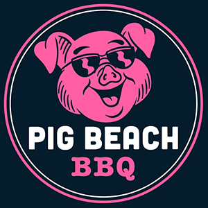
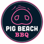
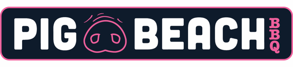
Pig Beach BBQ’s logos have evolved from a clean, minimalist pig snout badge to a playful pig-in-sunglasses design, all while keeping the bold pink-and-navy palette. Each variation balances simplicity with personality, reflecting the brand’s fun, approachable BBQ culture and ensuring strong recognition across menus, signage, and merchandise.
SUTE RESTAURANT LOGO
With their play on the word “soot” since the restaurant is all open fire and everything is smoke-kissed, I decided something simple like a ring of fire would be appropiate.
preston house logo design
The Preston House logo captures the refined elegance and historic charm of this boutique hotel and restaurant. With clean lines, timeless typography, and a subtle balance of modern simplicity and classic sophistication, the design reflects the property’s blend of contemporary luxury and rich heritage. The logo establishes a strong, versatile brand identity that seamlessly translates across menus, signage, and other branded materials.
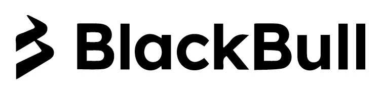
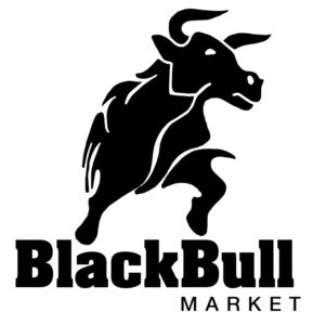
blackball market logos
BlackBull Market, a financial firm in New Zealand, first approached me to design a logo featuring both the bear and bull to represent market trends. A few years later, the focus shifted solely to the bull, reinforcing strength and optimism. Most recently, we simplified the identity further, using abstract bear claws alongside clean typography—modern, bold, and globally relevant.
mtk lobster house
The MTK Lobster House logo embraces a playful, nautical charm with a whimsical lobster, anchor, and lighthouse at its core. These coastal icons come together to reflect Montauk’s seaside character and the restaurant’s fresh, approachable spirit. The lively illustration paired with clean lettering creates a fun yet memorable identity that works seamlessly across menus, signage, and branded merchandise.
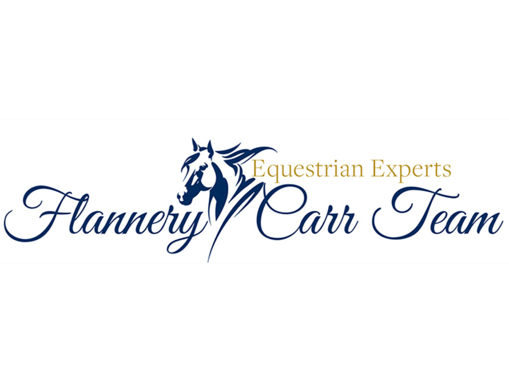
flannery carr team
Created for the Flannery Carr Team with Sotheby’s International Realty in Wellington, Florida, the logo combines luxury real estate sophistication with equestrian elegance. Refined typography and horse-inspired iconography highlight the team’s niche expertise while aligning seamlessly with the prestige of the Sotheby’s brand.
anker restaurant
The Anker logo was created for a modern waterfront restaurant in Greenport, drawing inspiration from nautical themes and coastal charm. With a clean, contemporary anchor motif paired with bold typography, the design reflects both the maritime heritage of the town and the restaurant’s fresh, elevated dining experience. Its simple yet striking form ensures strong recognition across menus, signage, and branded materials.
kinect solar group
The Kinect Solar logo embodies energy, innovation, and sustainability. Featuring a dynamic mark inspired by solar rays and forward motion, the design conveys both the company’s focus on renewable energy and its forward-thinking approach. Paired with modern typography, the identity communicates trust, technology, and a clean, environmentally conscious vision.
greenhill bbq
The Greenhill BBQ logo combines rustic charm with bold, modern appeal, capturing the authentic spirit of southern-style barbecue. Featuring strong, handcrafted typography and a warm, earthy aesthetic, the design evokes smoke, flame, and tradition while staying versatile across signage, menus, and merchandise. The result is a memorable brand identity that feels both welcoming and full of flavor.
moda koa clothing
The Moda Koa logo was created for a contemporary clothing store whose name incorporates koa, the Basque word for “joy” or “strength.” The design is anchored by a delicate dandelion stem, simple and fuss/petal-free, symbolizing a wish made and carried forward. Paired with clean, modern typography, the logo reflects both the lightness and meaning behind the brand: fashion that feels effortless, joyful, and timeless.
punch studios
Below is the Punch Studios logo, created for a boxing club in New York City, delivers bold energy and grit. Strong, impactful typography paired with a striking icon reflects the intensity of the sport while keeping a modern, urban edge. The design embodies strength, motion, and determination, perfectly capturing the spirit of the gym and its community.
sunlogix solar
The Sunlogix logo below represents innovation in solar energy with a clean, modern design. Using geometric forms inspired by sun rays and solar panels, paired with sleek typography, the logo communicates sustainability, technology, and forward progress. The identity projects reliability and vision, aligning perfectly with the company’s mission to power a brighter future.
salty rinse wine
Pictured above for Salty Rinse, a private-label Sauvignon Blanc, the logo channels coastal freshness and laid-back sophistication. With clean, flowing typography and a playful yet refined aesthetic, the design evokes ocean breezes and crisp flavors in every pour. It brings personality and approachability to the bottle while maintaining a polished, boutique wine feel.